

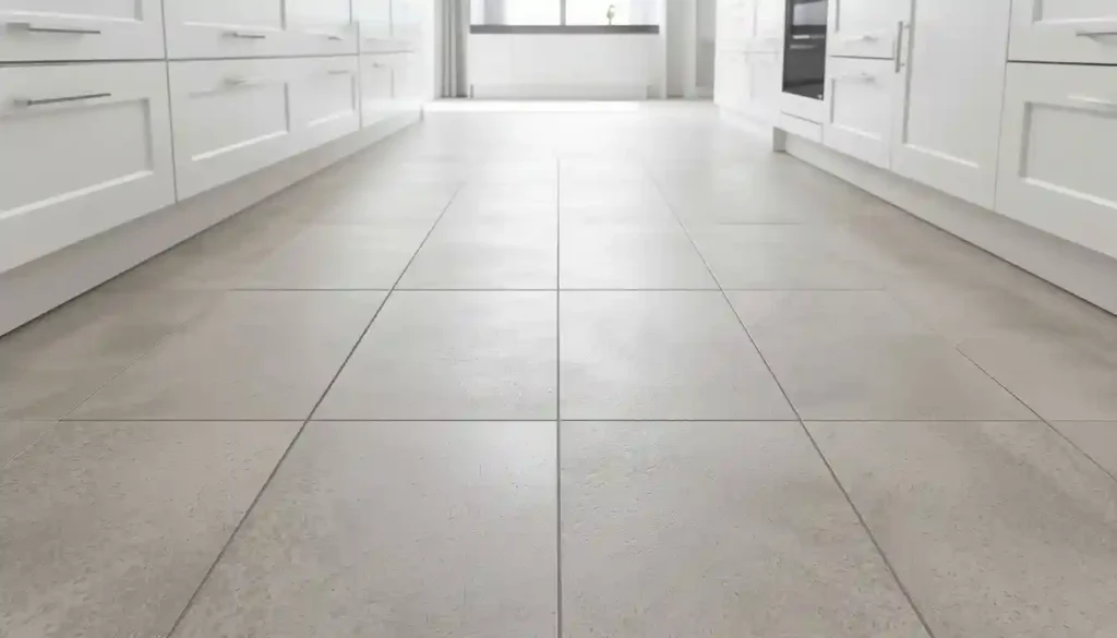
Grout color for large-format tiles in a grid layout is a consequential decision. A grout that closely matches the tile will make the grid lines virtually disappear, preserving the seamless look. A contrasting grout — even a shade or two off — will make each tile read as its own individual element, which some designers intentionally use to add definition to a plain floor. Neither approach is wrong, but going in with a clear intention is better than discovering the effect after installation.
The running bond offset, where each row is shifted by half a tile length, is common with rectangular large-format tiles like 12×24 or 24×48. Designers typically limit the offset to a third of the tile length rather than a half when working with very large tiles. A full 50% offset on big slabs can highlight any slight unevenness in the floor and create what installers call “lippage” — where one tile edge sits slightly higher than the adjacent tile.
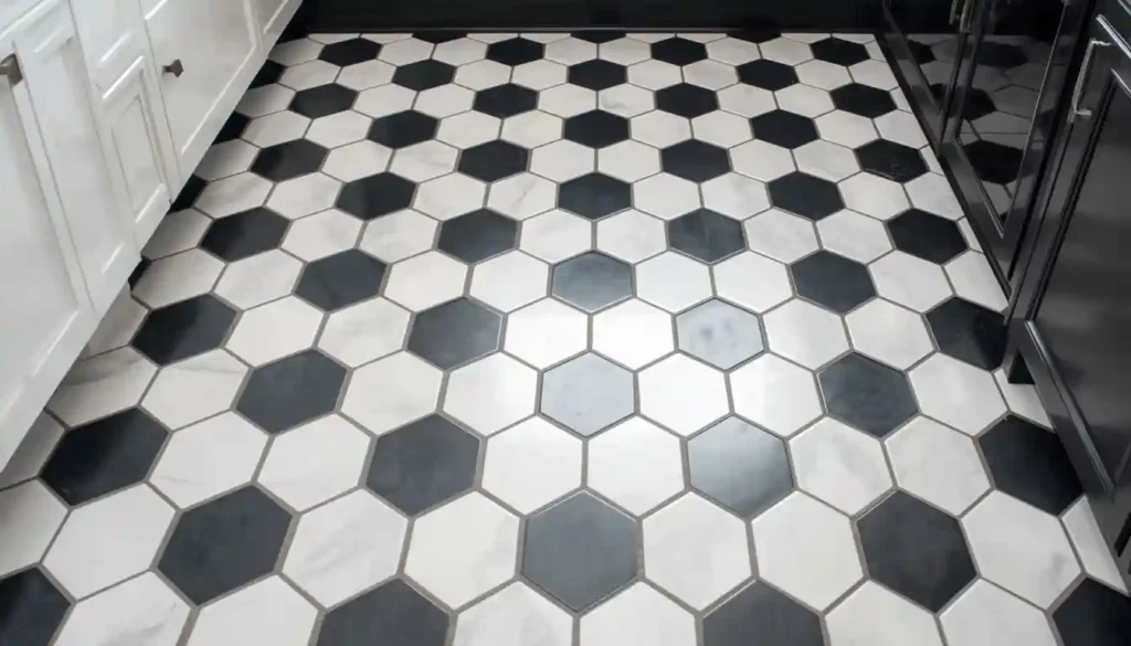
Idea 2: Classic Black and White Checkerboard
The black and white checkerboard is one of the oldest floor patterns in Western interior design, and it continues to look exactly right in the right kitchen. It belongs to French country farmhouses, retro American diners, art deco apartments, and mid-century bungalows with equal conviction. The reason it survives every trend cycle is that it is a genuinely graphic pattern — bold enough to hold its own against almost any cabinet color or countertop material.
The scale of the squares matters enormously. Traditional checkerboard uses 12×12 inch tiles set at 45 degrees so that the squares run diagonally across the room. This is the bistro-style version most people picture. A straight-set checkerboard with the same tiles set parallel to the walls reads more contemporary and slightly more restrained. Smaller squares — four or six inch tiles — create a denser pattern that feels more Victorian or Art Deco. Larger squares in a 16×16 or even 18×18 format soften the graphic impact while keeping the two-tone rhythm.
Modern takes on the checkerboard swap out strict black and white for pairs of colors that have more nuance. Navy and cream is a current favorite. Sage green and white reads very farmhouse-contemporary. Charcoal and warm beige is quieter and works in transitional kitchens where a hard graphic contrast feels too abrupt. These softer two-tone versions let you get the geometric energy of the pattern without the starkness that pure black and white can bring to a small or low-light kitchen.
Porcelain is the material of choice here because it offers true color consistency across tiles — important when you are relying on the sharp contrast between alternating squares to read cleanly. Ceramic works as well for indoor-only installations. If you want the warmth of natural material with the checkerboard look, unglazed terracotta in two different tones, or terracotta alternated with a stone tile, gives a much warmer result that works beautifully in Mediterranean-inspired or rustic farmhouse kitchens.
When this floor does appear in kitchen remodels, it almost always becomes the centerpiece of the room. That means the rest of the design choices — cabinet color, hardware, countertops — should support rather than compete with it. Plain cabinetry, simple subway tile or no backsplash tile at all, and restrained countertop patterning let the checkerboard floor claim its moment without the room feeling chaotic.
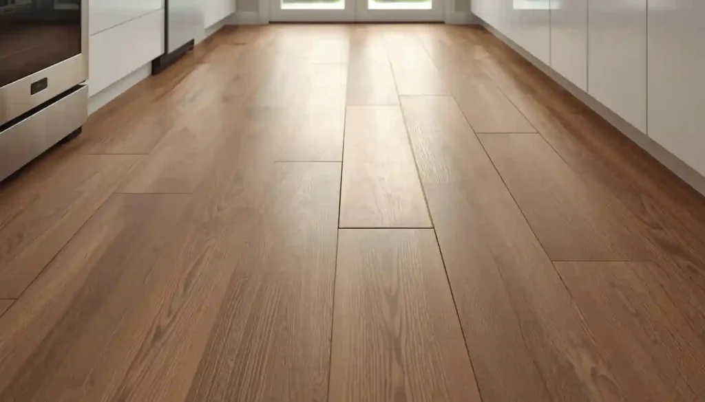
Idea 3: Wood-Look Porcelain Tile in a Plank Format
The appeal of wood-look tile is the combination of two things that are usually in tension with each other: the warmth and visual texture of hardwood flooring and the water resistance, durability, and easy maintenance of porcelain tile. In a kitchen — where water from the sink, cooking condensation, pet water bowls, and accidental spills are constant — wood-look porcelain solves the core problem with real hardwood in this environment.
The technology behind wood-look tile has advanced considerably. High-definition inkjet printing on the tile surface combined with textured surfaces that mimic wood grain makes modern wood-look porcelain convincing enough that visitors often cannot identify it as tile on sight. The best versions include variation between tiles in the same batch — slightly different grain patterns, color variation within the plank — so that the floor doesn’t read as a repeating digital stamp.
Plank-format tiles — long rectangles like 6×36, 8×48, or even 6×48 inches — are the most common format for wood-look tile because they approximate the proportions of real hardwood boards. Installing them in a straight running bond layout, the same way hardwood is typically laid, reinforces the wood illusion most effectively. For something more dynamic, a herringbone arrangement with wood-look planks is striking and far more elaborate looking than the straightforward grid, despite using the same tile.
The color range for wood-look tile now spans from very pale blonde oak tones through warm honey and amber shades, medium walnut and chestnut browns, and deep espresso and near-black tones. Lighter tones open up smaller kitchens and work well with white or light grey cabinetry. Medium warm tones pair naturally with cream, greige, or navy cabinetry. Darker tones create a moodier, more dramatic kitchen and tend to work best in kitchens with sufficient natural light or well-planned artificial lighting.
One detail that separates a convincing wood-look tile floor from one that looks obviously synthetic is grout line width. Real hardwood boards are laid tight together with essentially no gap. Wood-look tile, by contrast, needs an expansion gap for installation, and the grout lines should be kept as narrow as possible — 1/16 to 1/8 inch — and filled with a grout color that closely matches the tile’s background tone. Wide grout lines in a contrasting color break the wood illusion immediately.
If you are comparing this option against actual hardwood, a deeper look at how tile flooring compares to hardwood will help clarify the tradeoffs in terms of longevity, cost, and maintenance in kitchen conditions specifically.
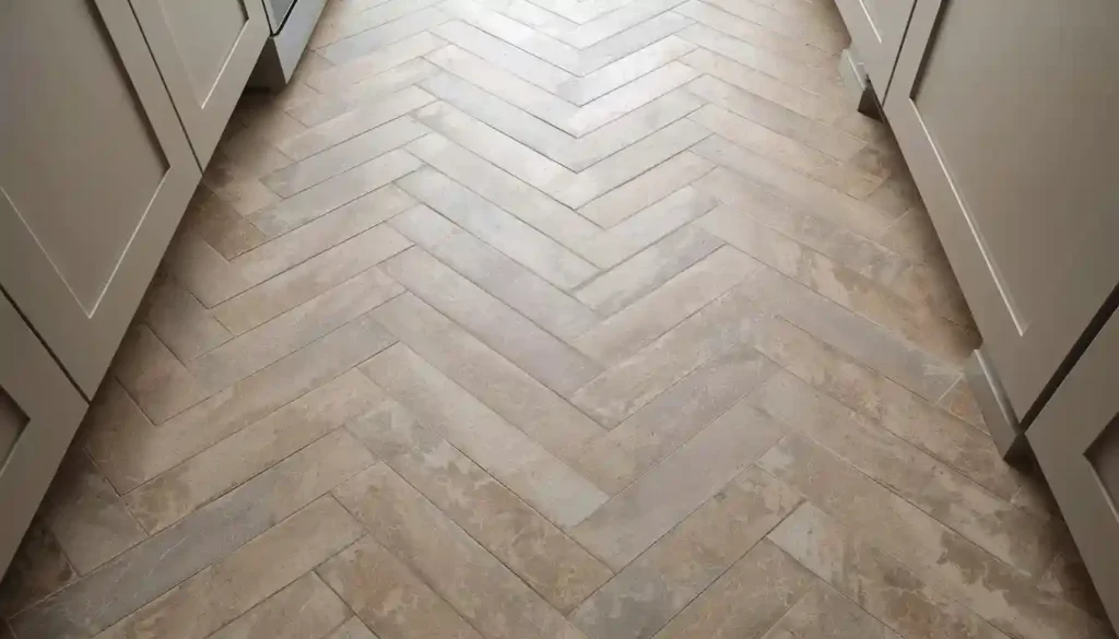
Idea 4: Herringbone Pattern in Neutral Porcelain
The herringbone pattern is one of the most visually energetic ways to lay tile without introducing additional color or material complexity. Every tile in a herringbone floor is the same — same color, same size, same material — but the angled arrangement creates a zigzag rhythm that gives the floor movement and visual weight far beyond what a simple grid would produce with identical tiles.
Herringbone works with rectangular tiles of most sizes, but the proportions of the tile affect how the pattern reads. Tiles with a 2:1 length-to-width ratio — like 2×4, 3×6, 4×8, or 6×12 inches — produce a classic herringbone with a clear V-shape. Tiles closer to square will create a pattern that is less distinctly herringbone and looks more like a loosely connected diagonal. Long, narrow tiles in a 3:1 or 4:1 ratio produce a very busy, dense pattern that suits small areas like kitchen islands or entryway insets more than full-floor coverage in a large room.
The angle at which herringbone is installed also shapes its effect. A standard herringbone is set at 45 degrees to the room’s walls, with the V-shapes pointing toward the main entrance or the most prominent wall. This is the most traditional orientation. A vertical herringbone — where the V-points run parallel to the longer wall — elongates the room visually and works especially well in narrow galley kitchens. A 90-degree arrangement, sometimes called a horizontal herringbone, is less common but gives a broader, more horizontal feel.
For kitchen floors specifically, the most enduring material choice for herringbone is a neutral porcelain in a light to mid-tone grey, warm greige, or soft cream. These colors allow the pattern itself to carry the design interest without the floor competing with the rest of the kitchen. Wood-look porcelain in a herringbone arrangement is also extremely popular — it gives the warmth of timber with the geometric precision of a tiled installation, and the result reads as both sophisticated and approachable.
Installation cost for herringbone is higher than a straight grid because of the additional cuts required at the perimeter of the room and the greater skill needed to maintain alignment over the full floor. This is worth budgeting for upfront. A poorly aligned herringbone is obvious and disappointing. A well-executed one is immediately impressive.
Understanding the broader family of available tile patterns — herringbone, basketweave, chevron, running bond, and more — is useful context for this decision. A detailed look at tile flooring patterns covers each option along with the kitchen styles they suit best.
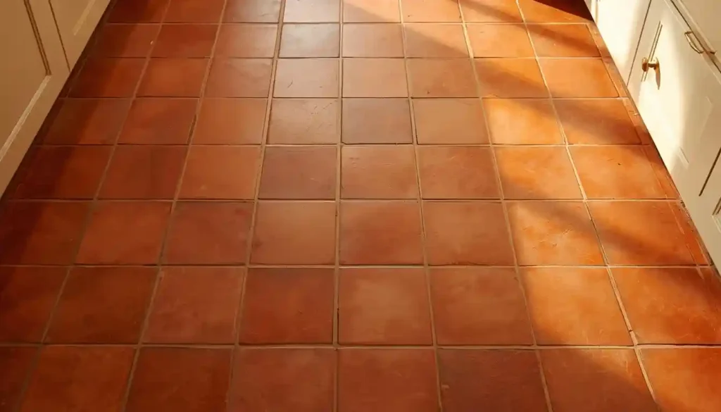
Idea 5: Terracotta Tile for a Warm, Organic Kitchen
Terracotta is experiencing one of the strongest design revivals of the current decade. After years of cold white kitchens with polished stone and stainless steel, the pendulum has swung decisively toward warmth — and nothing delivers warmth underfoot quite like unglazed or lightly glazed terracotta tile. The material is literally fired earth, and it looks it: slightly imperfect, color-varied from tile to tile, with a matte surface that catches and holds natural light in a way no factory-perfect porcelain can replicate.
Traditional handmade terracotta from Mexico, Spain, France, or Morocco is still available, but the natural material comes with care requirements. It is porous and needs sealing before installation and resealing periodically to resist staining. Kitchen conditions — oil splashes, sauce, coffee — will stain unsealed terracotta permanently. Once properly sealed, the material is more practical than its reputation suggests, but the maintenance commitment is real and worth factoring into the decision.
Porcelain tiles that replicate the terracotta look have become a genuinely good alternative. Modern ceramic printing and surface texturing can produce tiles that look nearly identical to hand-formed terracotta but with none of the porosity. These work especially well for homeowners who love the aesthetic but are not prepared for the sealing maintenance of the real material. The tradeoff is that the slight imperfections that make real terracotta charming — uneven edges, color variation across a single tile, subtle surface texture — are harder to replicate convincingly in porcelain. The best porcelain terracotta-look tiles are close but not exact.
Terracotta pairs instinctively with cream or white cabinetry, warm wood shelving, brass or aged bronze hardware, and natural stone countertops in warm-toned marble or travertine. The color palette it creates — red-orange floors, creamy white upper cabinets, warm wood accents, aged metal hardware — is deeply Mediterranean and immediately inviting. It also suits modern farmhouse kitchens, Spanish colonial revival styles, and the earthy boho-inspired kitchens that have become popular on design platforms.
For layout, terracotta tiles are most commonly installed in a simple running bond (brick pattern) or a straight grid. The material itself provides enough visual interest through its color variation and texture that an elaborate pattern is usually not necessary. Square tiles in the 8×8 or 12×12 inch range are traditional; rectangular formats like 6×12 or 4×8 in a running bond work well in more elongated spaces.
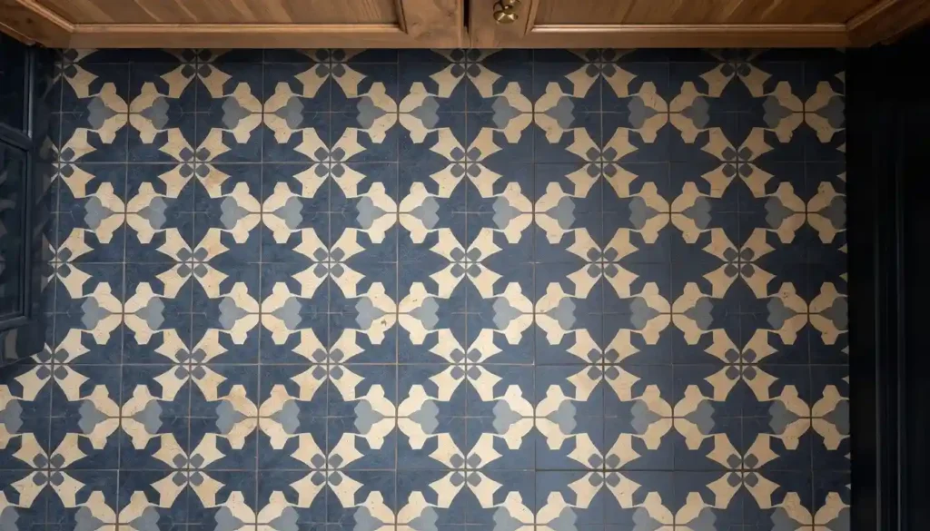
Idea 6: Encaustic and Cement Tile for a Statement Floor
Encaustic tiles — also called cement tiles — carry patterns that are pressed into the body of the tile itself rather than printed on a surface glaze. The color goes through several millimeters of the tile, which means the pattern does not wear away even with heavy foot traffic over decades. Originally made by hand in Morocco, Spain, and southern France, these tiles are now produced throughout the world in both traditional cement form and as porcelain versions that replicate the look with greater durability.
The design vocabulary of encaustic tile is rich: geometric patterns derived from Moorish architecture, floral motifs from Mediterranean folk art, bold graphic compositions that feel almost contemporary despite being rooted in centuries-old craft traditions. The most widely used patterns in kitchens today include eight-pointed star and cross combinations, bold quatrefoil repeats, diamond and floral combinations, and simple two-color geometric grids that create hypnotic repeating patterns at scale.
Because these tiles make such a strong visual statement, the most successful kitchen installations use them as a defined feature rather than wall-to-wall coverage. Installing encaustic tile only in the cooking zone — the area from the island to the range, for example — with a simpler complementary tile in the adjacent dining or living area creates a beautiful transition. Using them under an island only, or in an entryway that leads into the kitchen, gives the pattern room to breathe and makes the zone it defines feel distinct and deliberate.
Authentic cement encaustic tiles require sealing before grouting, immediately after grouting, and periodically thereafter. They are more porous than porcelain and will absorb cooking oils and food stains without protection. Many homeowners and designers now prefer the porcelain versions specifically because they eliminate this maintenance requirement entirely while delivering a very similar visual result. For heavily used family kitchens, porcelain encaustic-look tile is the more practical choice.
Color selection in encaustic tile can feel overwhelming because the options are nearly endless. The most enduring kitchen combinations tend to pair a warm neutral background — cream, sand, soft terracotta — with a deep accent color in navy, forest green, or black. This grounds the pattern and ensures it won’t feel dated in five years. Very bright, high-saturation color combinations in encaustic tile tend to follow trend cycles more closely and carry the risk of feeling too specific to a moment in time.
Idea 7: Marble-Look Porcelain for Accessible Luxury
Genuine marble on a kitchen floor is a long-standing aspirational choice — the veining, the depth, the cool smoothness underfoot are genuinely beautiful. It also comes with real drawbacks in a kitchen environment. Natural marble is relatively soft as stone goes, it scratches and chips more readily than porcelain or ceramic, and it is acidic-sensitive: lemon juice, vinegar, and tomato sauce will etch the surface if left in contact long enough. It requires sealing and careful maintenance.
Marble-look porcelain tiles address this gap directly. Modern digital printing technology, combined with surface texturing that mimics the slight reflectivity of honed or polished natural stone, produces porcelain tiles that convincingly replicate the look of Carrara, Calacatta, Statuario, and other classic marble varieties. These tiles are far harder than marble, impervious to acid etching, do not require sealing, and are significantly less expensive per square foot than genuine quarried marble.
The most important design decision with marble-look tile is the veining scale. Carrara-look tiles with fine, delicate grey veining on a white background are subtle and versatile — they work in almost any kitchen style, from minimal contemporary to traditional. Calacatta-style tiles with bold, dramatic veining in gold and dark grey on white make a much stronger statement and demand the rest of the kitchen be relatively restrained. Emperador-look tiles in dark chocolate brown with cream and gold veining suit rich, moody kitchens with dark cabinetry.
For kitchen floors, large-format marble-look porcelain — 24×24 or 24×48 — in a minimal grout arrangement is the most sophisticated approach. Bookmatching adjacent tiles so that the veining pattern creates a mirrored or continuating effect is possible with some tile lines and creates results that look genuinely architectural. This requires planning the layout before ordering tile and working with an installer who understands the technique.
A honed or matte finish is generally more practical for kitchen floors than a polished finish. Polished marble-look tile shows every footprint, water droplet, and cooking splash immediately. Honed porcelain has a similarly elegant appearance without reflecting light so sharply, and daily kitchen traffic looks less severe on its surface. This is one of the cases where the finish choice significantly affects the day-to-day experience of living with the floor.
If you are deciding between marble-look porcelain and genuine marble tile, the porcelain vs marble tile comparison breaks down the material differences, cost considerations, and practical performance in a kitchen setting in useful detail.
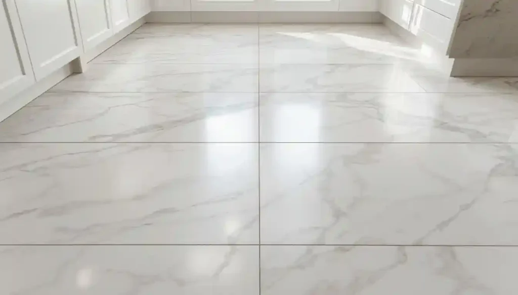
Image Prompt: A kitchen floor in large-format 24×24 honed marble-look porcelain tiles with soft grey Carrara-style veining on a white background. The tile floor is the dominant visual subject, photographed at a low-angle perspective to emphasize the surface and the subtle veining. Thin matching grout lines are nearly invisible. The tiles catch the light from a nearby window. White kitchen cabinetry and a glimpse of stone countertop are partially visible at the upper edges.
Idea 8: Hexagonal Tile for Geometric Personality
Hexagonal tiles bring geometric personality to a kitchen floor without the commitment of a full pattern like herringbone or checkerboard. A single color of hex tile in a simple all-over layout has a honeycomb quality that reads as both orderly and organic — it references natural forms (the structure of honeycombs, basalt columns, cells) in a way that rectangular tiles simply do not. The result is a floor that feels distinctive without being loud.
Hexagon tiles range from very small — the classic penny-size one-inch hex mosaic — up to large format 12-inch hexagons and even larger. Small hex mosaics mounted on mesh backing are a traditional bathroom floor choice, but they work well in kitchen areas too, particularly in tight spaces where the small repeat and high grout line density help disguise dirt between cleanings. Larger hexagons in the 6-inch to 12-inch range feel more contemporary and bold.
The two-color hexagon approach is one of the most visually interesting options currently popular in kitchen design. Alternating two colors of same-size hex tiles — black and white, cream and terracotta, navy and grey — creates a pattern that has more complexity than a simple checkerboard but with a softer overall geometry. The arrangement does not have to be strictly alternating either; a hex tile floor with a dominant neutral background and a single contrast-color accent tile used as a scattered highlight can look very considered and bespoke.
Grout is especially important with hexagonal tile because of the number of grout joints relative to tile surface area. Small hex tiles have an enormous amount of grout. Dark grout with light tiles makes the pattern graphic and bold. Light grout with light tiles is quieter and more refined. Dark grout with dark tiles creates a floor with texture and depth that doesn’t read as busy from a distance. The grout choice should be part of the initial design decision, not an afterthought.
For materials, porcelain and unglazed ceramic are the standard kitchen floor choices. Marble hexagons — either natural or in porcelain replication — have a particularly elegant result, especially in white Carrara or black Nero Marquina. Wood-look hexagons, though less common, are available and create an interesting contrast between the organic wood grain texture and the geometric hex form.
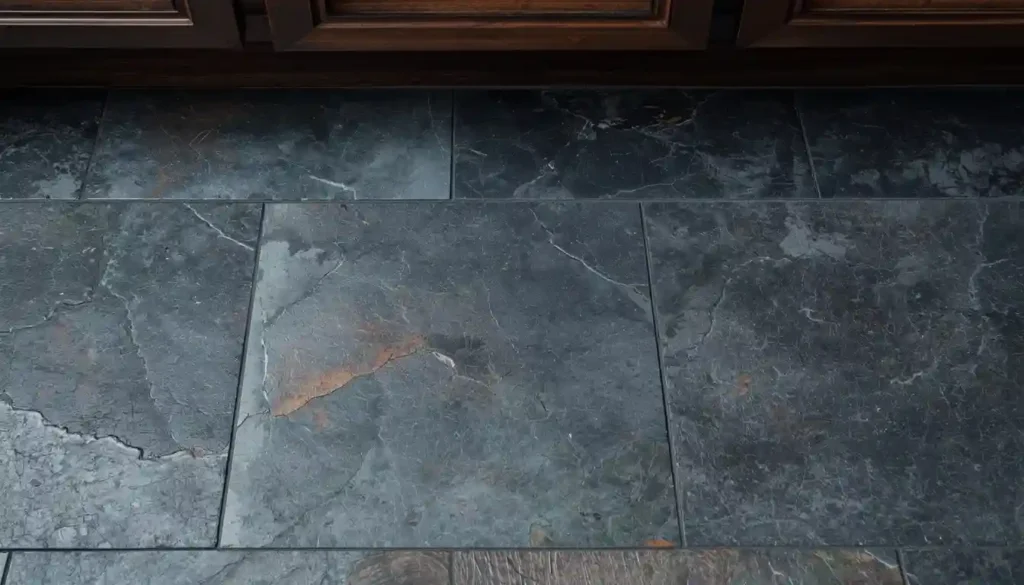
Idea 9: Slate and Stone-Look Tile for a Grounded, Natural Kitchen
Slate tile has a character that manufactured tile cannot completely replicate: the natural cleft surface, the irregular layering of the stone, the way it absorbs and holds light rather than reflecting it. In a kitchen, a slate floor creates a very specific atmosphere — grounded, serious, almost elemental. It suits kitchens designed around natural materials, dark cabinetry, exposed beams, or industrial touches like open shelving and raw-edge countertops.
Natural slate is available in a range of colors far wider than most people expect. Black slate is the most dramatic. Dark grey with blue and green undertones — sometimes called multicolor slate — has more visual depth. Green slate, which includes varieties from Vermont and India, is rich and unexpected. Purple and red-tinged slate varieties are rare but striking. The color in natural slate shifts depending on whether the stone is wet or dry, sealed or unsealed, which is part of its appeal.
The cleft surface of natural slate — the textured, uneven face that results from splitting the stone along its natural planes — provides good slip resistance, which is an asset in a kitchen where wet floors are a reality. The same irregular surface that provides grip also creates small pockets where dirt can accumulate, so regular cleaning is more involved than a flat porcelain surface. Sealing natural slate helps considerably by making the surface less absorbent.
Stone-look porcelain tiles that replicate the slate texture and color range offer the visual character with far less maintenance. Porcelain versions are harder, require no sealing, and can be cleaned like any other tile. The texture replication in high-quality stone-look porcelain is now sophisticated enough that the visual result is convincing, though the slight warmth and irregularity of real stone is still not perfectly reproduced.
Regardless of whether you choose real slate or porcelain that mimics it, the installation decisions that matter most are grout color and layout. Slate installs well in a random ashlar pattern — irregular rectangular pieces of varying sizes laid without a strict repeat — which emphasizes the natural character of the material. It also works in standard square or rectangular layouts. Dark grey grout, close to the stone color, keeps the floor reading as a continuous surface. For more on how natural stone compares in the tile category, a look at the natural stone tile flooring guide covers the full range of materials and how they perform in different environments.
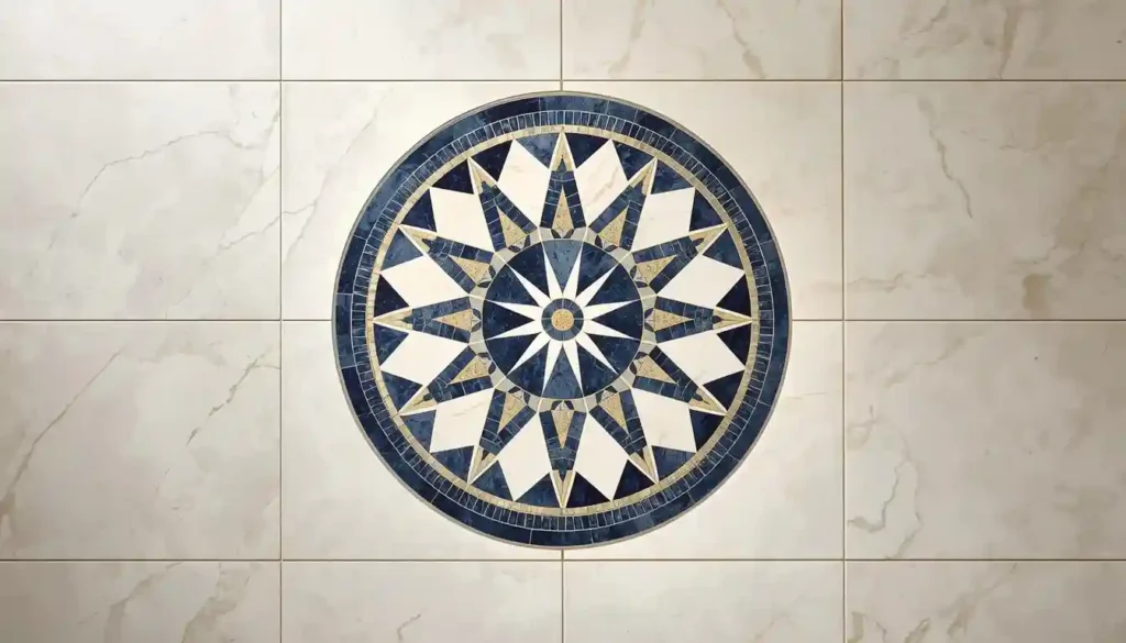
Idea 10: Patterned Mosaic Tile as a Feature Zone
Using decorative mosaic tile across an entire kitchen floor can be overwhelming — the pattern competes with everything else in the room and makes the space feel smaller. The more elegant approach is to use mosaic tile as a defined feature zone within a larger floor. The cooking zone between the island and the range. A distinct threshold tile that marks the entry into the kitchen from the adjoining living space. A border that frames the perimeter of the room. These defined uses let the mosaic be clearly intentional without taking over the whole design.
Mosaic tiles today encompass an enormous variety: small square tiles in a grid pattern, penny rounds, arabesque (shield-shaped) tiles, fish scale (scallop) tiles, elongated hexagons, classic basketweave patterns combining squares and rectangles, and completely custom designs using cut stone or glass. The material options are equally varied — porcelain, ceramic, natural marble, glass, metal, and combinations of these.
For kitchen floor use specifically, glazed ceramic and porcelain mosaics are the most practical because they are impervious to staining and easy to clean. Natural marble mosaics have a higher-end appearance but require sealing and more careful maintenance. Glass mosaic tiles are visually stunning — particularly in backsplash applications — but their smooth surface can be slippery when wet, making them less suitable for kitchen floors where wet conditions are common.
A feature medallion mosaic — a circular or rectangular mosaic panel set into a simpler field tile — is a traditional approach that still works beautifully. These medallion pieces can be purchased as pre-assembled panels sized to drop into a specific cut-out in the field tile installation. They work particularly well centered under a kitchen island, where they define the island’s footprint visually and create a moment of elevated detail in the floor.
The key to making a mosaic feature zone work is transition. How the decorative mosaic meets the field tile on either side of it needs to be resolved in the design plan before installation, because the edge condition will be clearly visible. A metal or stone border strip, a row of the field tile running parallel to the mosaic edge, or a purposeful geometric alignment between the two tile patterns are all approaches that can make the transition look designed rather than incidental.
Idea 11: Two-Tone Diagonal Tile for Visual Drama
Setting tile diagonally — at 45 degrees to the room’s walls — is one of the most effective techniques for making a kitchen feel larger than its footprint. The diagonal line, running corner to corner of the room, draws the eye along its longest possible path rather than across the shorter wall-to-wall distance. In a compact kitchen where straight-set tile would feel constrained, a diagonal layout with the same tile can add a sense of breadth and depth.
The effect is amplified when two tones of the same tile are used in a diagonal offset. This is distinct from the standard checkerboard — it is not alternating equal squares in two colors. Instead, it might be a primary neutral tile set diagonally with small accent squares at each joint (these are called “dot” or “feature” inserts), or a subtle two-tone diagonal where 90% of the tiles are one color and 10% are a slightly contrasting tone placed at intervals. These arrangements create rhythm and movement without the full graphicness of a true checkerboard.
For materials, a diagonal layout works particularly well with large-format tiles because the diagonal direction becomes more apparent at larger scales. A 16×16 porcelain tile set at 45 degrees has more visual impact than a 6×6 set at the same angle. The cut pieces at the room’s perimeter are larger and more pronounced, which actually adds to the design effect rather than looking like waste.
Choosing which wall to align the diagonal to matters. Typically, the center of the room is found, and the tile layout is centered on that point with the diagonal running from corner to corner of the room. Alternatively, the diagonal can be centered on a feature element — the island, the range, a window — so that the tile’s geometric focal point aligns with the room’s visual focal point.
This idea works well in transitional kitchens that want some visual energy without fully committing to a pattern tile. A soft grey and slightly warmer greige in a large diagonal format, for example, has movement and interest but won’t date quickly. For anyone who wants to understand what installation approaches work best before calling a professional, a look at how tile flooring patterns are laid provides useful background on layout, starting points, and cut-tile management at room perimeters.
Choosing the Right Tile for Your Kitchen
All eleven of these ideas work — but not all of them work for every kitchen. The starting point for narrowing the options is understanding your kitchen’s actual conditions: how much foot traffic it takes, whether there are pets or young children, how much natural light it receives, and what your maintenance threshold genuinely is. A terracotta floor in a kitchen used by four active kids and two dogs is a different proposition than the same floor in a couple’s weekend cooking space.
Material durability in a kitchen context deserves careful thought. Porcelain is the most durable tile material for this environment — harder than ceramic, nearly impervious to water, and resistant to staining. It handles kitchen traffic well even in high-traffic households. Ceramic is suitable for kitchens with moderate to medium traffic. Natural stone materials like marble, slate, and terracotta vary in their porosity and hardness and generally require more intentional care. Understanding where your chosen material falls on the spectrum of ceramic versus porcelain tile is useful before committing to a specific product.
Tile thickness and the subfloor condition interact with each other in ways that affect both installation cost and long-term performance. Thicker tiles are heavier, require a more robust substrate, and are generally less forgiving of subfloor deflection. If your kitchen subfloor has any spring or movement to it, a thinner tile with a properly reinforced substrate is often a better outcome than a thick tile over a marginal one. A professional subfloor assessment before tile selection is a worthwhile step on any significant tile project.
Grout deserves as much attention as the tile itself. The choice of grout — sanded versus unsanded, standard versus epoxy, the specific color — affects both the visual outcome and the maintenance experience over time. Epoxy grout, while more expensive and more demanding to install, is highly stain-resistant and will maintain its color with considerably less maintenance than cement-based grout. In a kitchen, where grout lines will be exposed to cooking oils, food residue, and cleaning chemicals repeatedly, the investment in quality grout and professional installation pays dividends over the life of the floor.
For the installation itself, the difference between a professional installation and a DIY attempt is often most visible in a kitchen because the layout demands are specific — centering the tile correctly relative to the room and its focal points, managing cut tiles at cabinets and appliances, maintaining consistent grout joint width across a large floor area. A clear understanding of what professional tile installation costs in your area will help you set the right budget and avoid the disappointment of a beautifully selected tile that is let down by its execution.
Finally, tile that has been chosen for its visual character needs to be cared for in a way that preserves it. The best-looking tile kitchen floors are ones where the tile was chosen thoughtfully and then maintained well. Sealing grout lines annually, using pH-neutral cleaning products, and addressing spills promptly are the habits that keep a tile kitchen floor looking the way it did the day it was installed — which in a quality tile installation can be decades rather than years.