For installation, a rectified large-format tile — one that has been machine-cut to precise dimensions — allows grout joints as narrow as 1/16 inch, which is essential if you want the near-seamless look that makes this idea work. The subfloor must be flat to within 1/8 inch over 10 feet; any deviation shows on a large tile as a lip at the joint, so leveling compound is often a necessary first step. You can find detailed guidance on this in the best subfloor for tile flooring guide.
Use a matching or near-matching grout in a light to medium grey. A bright white grout will emphasize every joint and undercut the seamless quality; a dark grey grout will create a visible grid. The goal is for the grout to blend, not announce itself.
2. Grey Marble-Look Porcelain for a Luxurious Entryway
An entryway is the first surface a visitor reads, and grey marble-look porcelain tiles deliver maximum visual impact with considerably less maintenance complexity than genuine marble. Modern inkjet printing technology has reached a point where the veining in high-end marble-look porcelain tiles is virtually indistinguishable from the real stone at a glance — the difference emerges only on close inspection, where natural marble shows depth and variation that no printed tile fully replicates.
The design logic for entryways is specific. The space is typically narrow and transient, so pattern and contrast work harder here than in rooms where people linger. A polished or semi-polished finish on grey marble-look tile creates reflections that amplify the available light in what are often interior-facing, window-poor spaces. The veining — white and gold veins on a mid-grey ground, or darker grey and charcoal streaks on a lighter ground — gives the eye something to follow across what might be a small footprint.
Calacatta-style greys (predominantly white with bold grey veining) keep the entry bright. Grigio Carnico and Bardiglio styles (mid-to-dark grey grounds with lighter veining) create a more dramatic, formal reception. The direction of the vein pattern matters too: laying tiles so veins run in a consistent direction, called “bookmatching,” creates a sense of continuity that reads as expensive even in a modest-sized entryway.
Pair a polished grey marble-look floor in the entry with a matte finish on any tile used in adjoining areas. The contrast between the reflective entry floor and a matte surface elsewhere acts as a natural threshold that delineates spaces without a transition strip. For more on how tiles perform as you move from space to space, the discussion of tile flooring over concrete is worth reading, particularly for homes where the subfloor type changes at the entry.
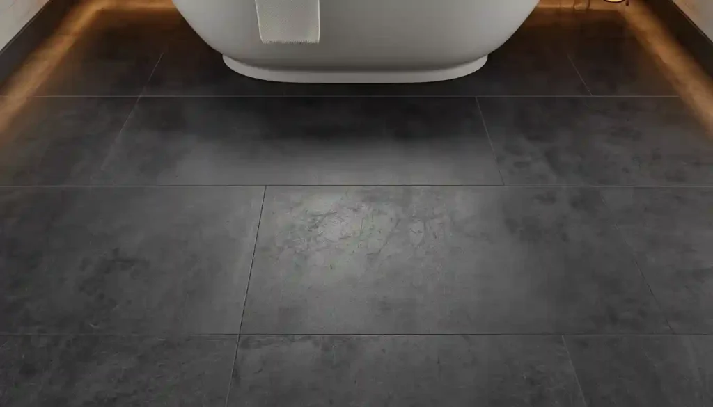
3. Dark Charcoal Tile in a Moody, Spa-Like Bathroom
Dark grey tile — charcoal, graphite, anthracite — in a bathroom is a move that divides homeowners but consistently impresses designers. The reason is simple: darkness in a wet room triggers the same visual logic as darkness in a forest pool. It signals depth, it focuses the eye on textures rather than dimensions, and it makes architectural fixtures (a freestanding tub, a rain showerhead, a vessel sink) read as objects rather than as afterthoughts on a clinical white background.
The practical anxiety around dark bathroom tile is light. Rooms with a single north-facing window will indeed read as cave-like with dark floors if no compensating strategies are used. Those strategies exist, however. Backlit mirrors introduce flattering, shadowless illumination without bleaching the floor. Recessed ceiling spotlights directed onto the tile surface pick up the texture rather than washing it out. A floating vanity with an LED strip underneath creates a horizon of warm light at floor level that gives the dark tile a luminous halo effect.
For texture, a honed or matte finish on dark charcoal tile is almost always the correct choice over a polished finish. Polished dark tile shows water marks, soap residue, and foot smudges almost continuously and requires near-constant wiping to look intentional. A matte or textured dark tile hides the evidence of daily use while still delivering the moody, saturated color that makes this look compelling. Slate-look porcelain and concrete-effect charcoal tiles, because of their built-in surface variation, are particularly forgiving in this regard.
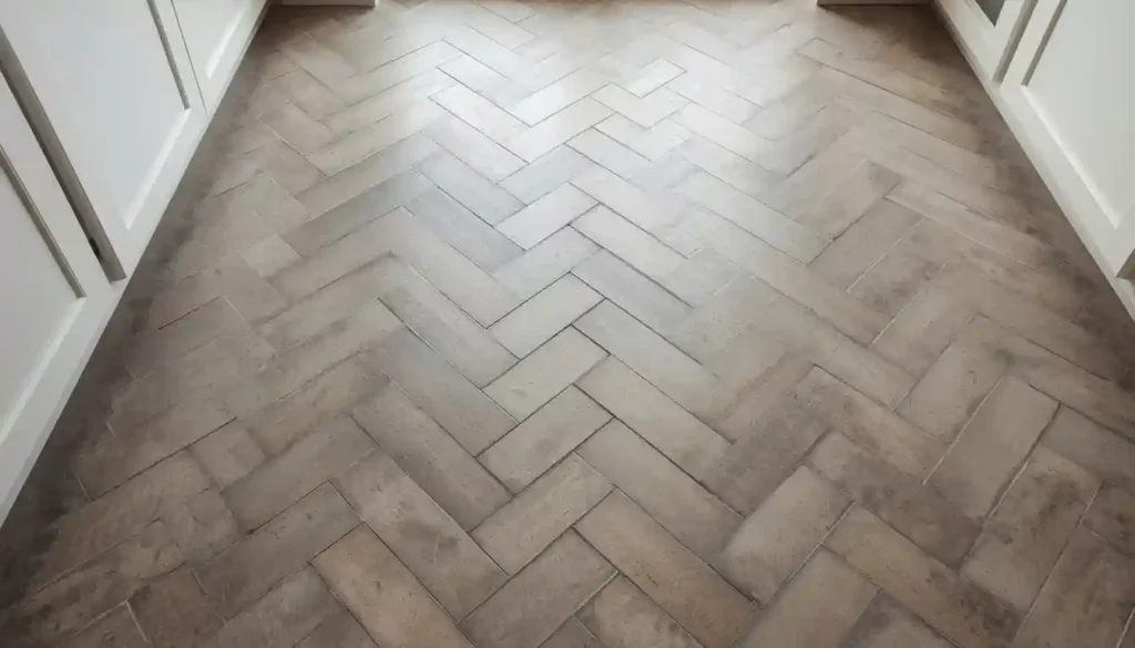
4. Grey Herringbone Tile for a Kitchen That Feels Handcrafted
Herringbone is one of the oldest documented floor tile patterns — a chevron-like zigzag formed by laying rectangular tiles at 45-degree angles to each other so the short end of one tile meets the long side of the next. In grey tile, this pattern does something that a straight lay cannot: it introduces directionality and perceived motion into a surface that would otherwise be static, and it makes the material itself feel more intentional, more considered, less builder-grade.
For kitchens, grey herringbone tile works on two scales. Small-format herringbone — tiles roughly 2×4 inches, 3×6 inches, or the elongated “Venetian herringbone” format — creates a fine-grained texture that reads as textile-like from a distance. This scale suits galley kitchens, narrow kitchen corridors, and any space where the floor needs to be interesting without competing with elaborate cabinetry. Large-format herringbone — 4×12 inch or 6×24 inch planks laid in a herringbone pattern — is bolder and more graphic, suited to open kitchen-dining rooms where there is enough floor area to appreciate the scale of the pattern.
Grey is the perfect color family for herringbone tile because the pattern itself provides sufficient visual energy without requiring a strong color commitment. A soft dove grey in a herringbone layout gives a kitchen the personality of a traditional European farmhouse without any of the color risk. A cooler, more saturated mid-grey herringbone in rectified porcelain reads as distinctly contemporary. The grout color is a critical choice: a grout that is two to three shades darker than the tile defines each individual piece and makes the herringbone pattern read clearly; a matching grout softens and blurs the effect for a quieter, more tonal result.
You can explore how different tile flooring patterns change the perceived scale of a room in the dedicated tile flooring patterns guide, which covers herringbone alongside offset, chevron, and versailles arrangements with specific recommendations for room size and ceiling height.
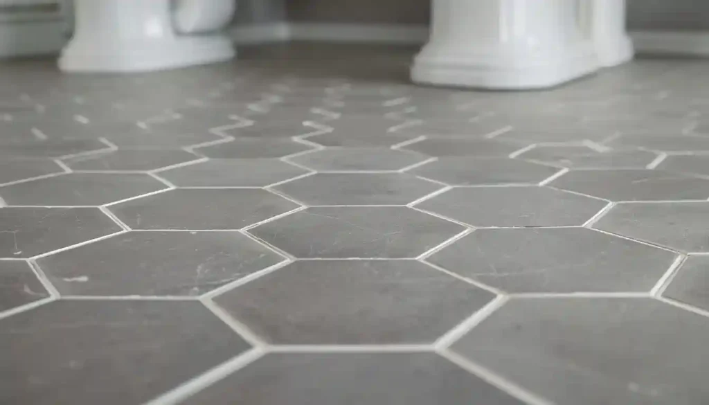
5. Grey Hexagonal Tile in a Vintage-Modern Bathroom
Hexagonal tiles have been used on bathroom floors since the early twentieth century, which is precisely why they carry a nostalgic quality that no other format replicates. When those hexagons are grey — whether a neutral mid-grey, a pale silver, or a deep slate — the effect is a bathroom floor that feels simultaneously historical and fresh, the kind of surface that appears in renovated pre-war apartments and boutique hotels in equal measure.
The size of the hexagon changes the character of the design dramatically. Small mosaic hex tiles (1 inch to 2 inch) — especially white with dark grey grout, or grey with white grout — produce the classic “penny tile” or “subway bathroom” look associated with the Arts and Crafts and early modernist periods. The tighter the grout grid, the more antique the reference. Medium hexagons (4 inch to 6 inch) in grey porcelain or ceramic straddle the vintage and contemporary registers: large enough to show color and texture clearly, small enough to maintain the geometric interest across the floor. Large hexagons (8 inch to 12 inch) in a polished grey marble or a honed grey porcelain tip firmly into contemporary territory and work best in larger, lighter bathrooms where the scale of the pattern does not overwhelm the room.
One of the most effective applications of grey hexagonal tile is the mixed-tone layout: a base field of light grey hexagons interrupted at irregular intervals by a darker charcoal hexagon of the same size, creating a scattered, constellation-like effect that is more dynamic than a uniform color field without requiring a second tile order.
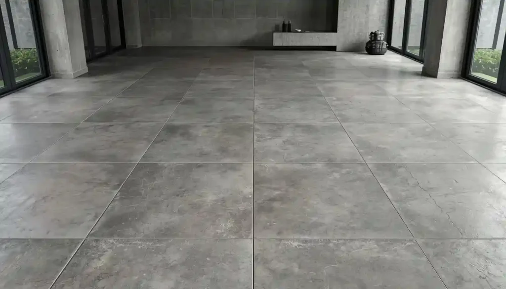
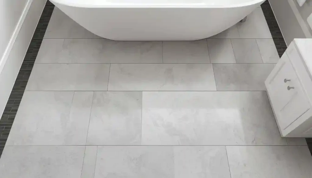
6. Concrete-Look Grey Tile for an Industrial-Modern Interior
Poured concrete floors carry a specific aesthetic authority — they read as raw, unornamented, and architecturally direct. The problem with actual concrete in residential settings is a long list of practical objections: it needs professional installation, requires sealing and periodic re-sealing, can crack over time as the substrate shifts, and is permanently cold underfoot. Concrete-look grey porcelain tile solves all of those objections while preserving the visual signature of the material almost completely.
The best concrete-look grey tiles are produced with high-definition digital printing that mimics the subtle tonal variation, aggregate marks, and occasional surface pitting of real poured concrete. The most convincing versions come in large formats — 24×24, 30×30, or 24×48 inch panels — because the visual logic of concrete is that it is a continuous, poured surface; small tiles that clearly repeat their pattern undermine the illusion. A matte or micro-textured finish is essential; a polished concrete-look tile collapses the reference entirely because real concrete is never polished to a mirror shine in the same way.
In terms of color palette, concrete grey ranges from a light warm grey (the kind produced by pale aggregate in a white cement mix) to a cool, blue-tinted mid-grey (closer to standard Portland cement) to a dark anthracite that suggests dyed or polished industrial concrete. Each shade implies a slightly different design companion: light warm concrete grey pairs naturally with blond wood, terracotta, and olive green; medium Portland grey suits white walls, black steel frames, and leather; dark anthracite belongs with exposed brick, raw linen, and either natural oak or painted-black cabinetry.
For anyone considering a grey tile floor in a space with underfloor heating, the thermal properties of porcelain tile — its high density and excellent heat conductivity — make it one of the most efficient surfaces for a radiant system. The best tile flooring for underfloor heating article covers exactly which tile types and installation methods deliver the best heating performance, which is directly relevant here.
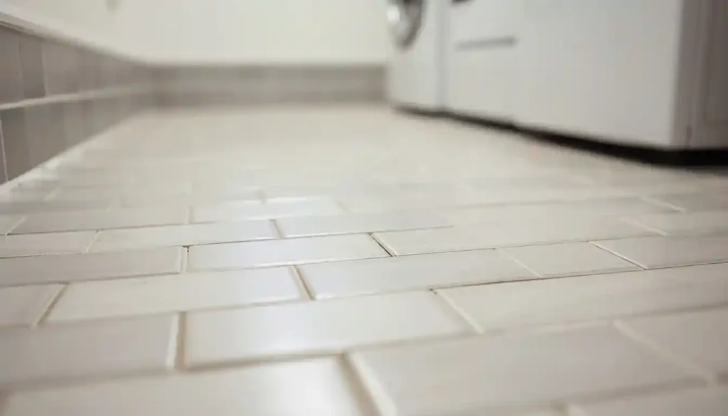
7. Light Grey Subway Tile in a Classic Bathroom or Laundry Room
The 3×6-inch rectangular “subway tile” format has been a standard reference point in American interiors since the early 1900s, when it was used in the original New York subway stations. On floors rather than walls — which is a less common but often more interesting application — grey subway tile laid in a horizontal brick-bond pattern creates a surface that reads as both traditional and contemporary, depending entirely on what surrounds it.
On a bathroom floor, light grey subway tiles in a running-bond or herringbone pattern work particularly well in rooms that already use subway tile on the walls, creating a cohesive “all subway” environment that feels curated rather than matched by accident. The key is to vary the grout color between floor and wall: bright white grout on wall subway tile with a medium grey grout on floor subway tile gives each plane its own visual weight while maintaining material continuity.
In laundry rooms, grey subway tile on the floor solves a practical problem. Laundry rooms are high-moisture, high-traffic spaces where staining, scuffing, and water splash are constant. A light grey matte-finish subway tile conceals mid-level dirt far better than either white (which shows everything) or dark (which shows every dried water drop and lint trace). The grout lines in a small-format tile also provide additional slip resistance compared to a large smooth slab, which matters in rooms where wet feet are common.
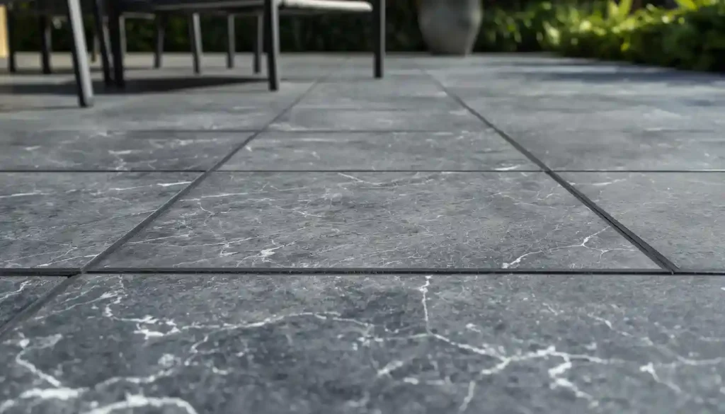
8. Grey Slate-Look Tile for an Outdoor Patio or Pool Surround
Natural slate is the quintessential stone for outdoor and semi-outdoor spaces: its dark, cleft surface is inherently non-slip, its tonal range — running from charcoal black through blue-grey to silver and rust — adds visual depth that smooth concrete cannot match, and it weathers gracefully rather than degrading. Genuine slate’s practical weakness is that it is a layered stone that can delaminate with freeze-thaw cycling; it also varies significantly in thickness from piece to piece, making a perfectly level installation challenging. Grey slate-look porcelain tiles are the engineered solution: they reproduce the cleft surface texture and color variation of natural slate while offering the dimensional consistency, frost resistance, and low maintenance of fired ceramic.
For patios, the standard caution around tile flooring is slip resistance. A tile destined for an outdoor surface must have a Dynamic Coefficient of Friction (DCOF) rating of 0.42 or higher when wet. Most slate-look porcelain tiles produced for outdoor use are designed with this in mind, but it is worth confirming with your supplier before purchasing. A cleft or deeply textured surface texture, which is standard on slate-look products, naturally achieves higher DCOF ratings than smooth surfaces.
For pool surrounds specifically, the grey tone of slate-look tile serves a functional purpose beyond aesthetics: it absorbs less solar radiation than dark tile (which can become uncomfortably hot underfoot) but reflects less glare than white tile (which can cause eye discomfort in strong sunlight). Medium grey occupies an effective middle ground. The best tile flooring for outdoors guide covers the full technical specification for outdoor tile selection, including freeze-thaw ratings, DCOF requirements, and installation details for different climates.
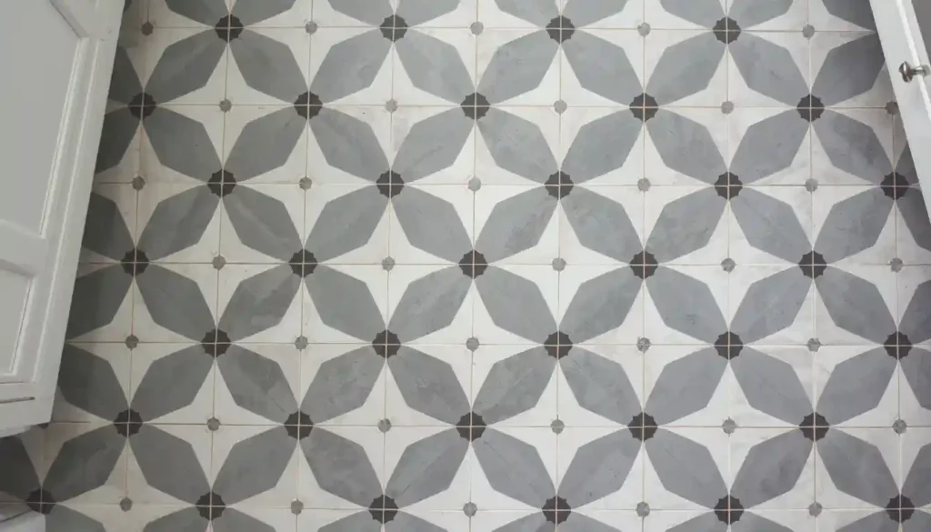
9. Grey Encaustic Cement Tile for a Statement Entryway or Kitchen Floor
Encaustic cement tiles — handmade tiles in which colored cement is poured in layers to create a pattern that extends through the full tile thickness, not just a surface print — represent one of the most visually expressive flooring options available. When grey is one of the colors in the palette (and it almost always is, whether as the ground tone or as an accent), the result is a floor that combines the material solidity of cement with the graphic energy of a pattern that could have come from a Moroccan medina, a Victorian hallway, or a contemporary design studio.
Grey encaustic tiles pair well with both white and off-white backgrounds because the grey ground tone anchors the pattern without competing with wall colors. The most versatile palettes combine grey with white and black for a crisp, high-contrast geometric design, or grey with dusty blue and terracotta for a warmer, more artisanal effect. Unlike printed porcelain tiles, every encaustic cement tile has slight color and texture variation from the handcrafting process, which means a cement tile floor has a “made” quality that machine-produced surfaces never achieve.
On the practical side, encaustic cement tiles require sealing before grouting (to protect the surface from grout haze), sealing after grouting, and periodic re-sealing depending on traffic levels. They are softer than porcelain and will show scratches from dragged furniture or grit underfoot if not protected. In kitchens, where dropped pots and pulled-out chairs are constant, a matte-sealing maintenance program is non-negotiable. That said, the patina that cement tiles develop over time — a gradual softening of the surface colors and a gentle accumulation of use marks — is considered a feature by their advocates, not a flaw.
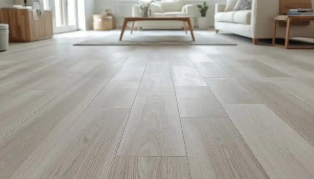
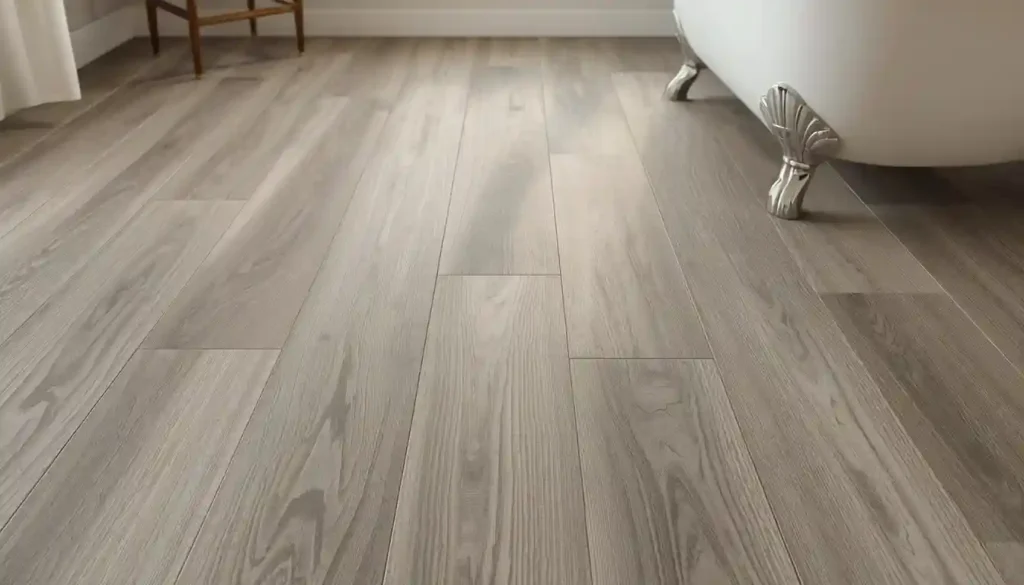
10. Grey Wood-Look Tile for Kitchens and Bathrooms
The grey wood-look tile concept bridges two separate design instincts: the warmth and organic quality associated with wood flooring, and the water resistance and durability associated with tile. The result is a plank-format tile — typically 6×36 inches, 8×48 inches, or similar elongated ratios — finished with a surface texture and color pattern that mimics a grey-stained or weathered hardwood timber. The quality of this mimicry varies enormously between manufacturers; the best examples are convincing enough to prompt genuine questions about whether the floor is wood or tile.
Grey wood-look tiles solve a specific room problem: what to do in a bathroom or kitchen where you want the warmth of a wood floor but cannot install real hardwood without significant moisture risk. A grey-toned wood-look plank tile in a bathroom brings the visual warmth of pale driftwood or silvered oak into a wet environment without any of the warping, swelling, or mold risk that genuine wood carries in those conditions.
For installation, long plank-format tiles — anything over 24 inches in length — require additional attention to substrate flatness and lippage prevention. The longer the tile, the more visible any height difference between adjacent tiles becomes at the joint. A random-length installation pattern (mixing tiles of three different lengths, the way real wood flooring is laid) reduces the appearance of any minor lippage and also more convincingly mimics the look of real wood. Grey wood-look tile laid in a herringbone or diagonal pattern is a genuinely sophisticated option that makes the tile format look entirely intentional rather than like a wood substitute.
For homeowners who are still weighing genuine hardwood alternatives, the comparison guide on tile flooring vs. hardwood covers the full decision matrix including cost, durability, installation requirements, and resale value implications.
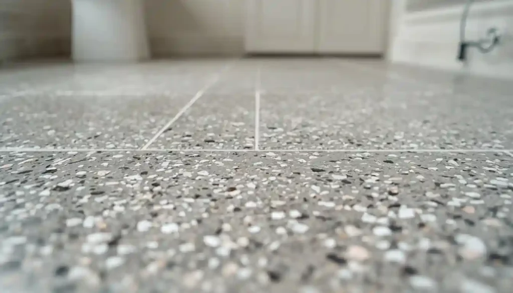
11. Grey Terrazzo Tile for Playful Contemporary Spaces
Terrazzo — the composite material made from chips of marble, glass, quartz, or granite set in a cement or epoxy binder and then ground flat — has experienced a sustained design revival over the past decade. In its grey-ground incarnation, terrazzo tile produces floors that are simultaneously clean and complex: the grey base reads as a neutral, while the colored aggregate chips within it introduce flickers of pink, white, black, gold, or green that give the surface a depth no solid-color tile can match.
Grey terrazzo tile is particularly effective in spaces that are meant to feel both sophisticated and approachable — children’s playrooms where you want something durable but not industrial, café-style kitchens where the floor needs to be practical but not clinical, and bathrooms where a spa-like cleanness is the goal but you want to avoid the sterility of all-white. The aggregate chips in a grey terrazzo tile reflect light in a way that makes the floor appear to shift slightly as you move through the space, which adds a liveliness that solid tile cannot achieve.
Modern terrazzo porcelain tiles — as opposed to poured terrazzo or traditional cement terrazzo — are dimensionally consistent, moisture-proof, and easy to maintain, removing the traditional practical objections to the material. They are available in the same large formats as conventional porcelain and can be specified with very fine grout joints, which preserves the visual continuity of the terrazzo pattern across the floor.
12. Two-Tone Grey Tile Grid for a Minimalist Master Bath
One of the most refined grey tile flooring approaches involves using two different shades of grey in a deliberate geometric grid — not a checkerboard, which tends to read as retro, but a more understated proportion like a 4:1 or 6:1 ratio field tile to accent tile. In practice, this might mean a floor of large light grey 24×24 inch tiles with a single row of 6×24 inch dark charcoal inset tiles running the perimeter of the room, or a field of 12×24 light grey planks punctuated at regular intervals by a course of deep graphite tiles.
The visual logic of this approach is borrowed from traditional stone masonry, where a darker border stone defines the perimeter of a paved courtyard or frames a central medallion. Applied to a master bathroom, the effect is architectural rather than decorative: the floor looks like it was designed by someone who understood the geometry of the room and used the tile pattern to reinforce that geometry, rather than simply covering the floor in material.
Two-tone grey tile grids also solve a common bathroom design problem: the floor that needs to do something interesting but cannot afford to be loud, because the room has already invested visual energy in statement fixtures, a bold vanity, or dramatic wall tile. By keeping the floor entirely within the grey family but introducing a structural contrast, you give the floor a presence without making it compete with anything else in the room. The best tile flooring for bathrooms article develops this design logic further, with specific recommendations for tile format and finish depending on bathroom size and natural light levels.
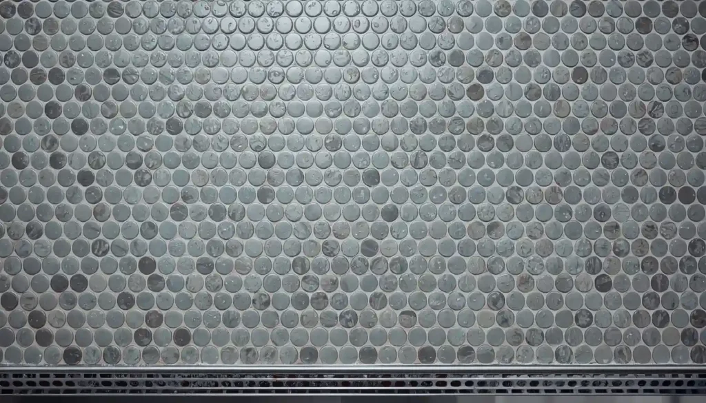
13. Grey Mosaic Tile Shower Floor with a Pebble or Penny Tile Texture
A shower floor operates under a specific set of constraints that are different from any other surface in a home: it must be slip-resistant when wet, it must drain properly, and it must withstand daily exposure to cleaning products, body oils, hard water, and temperature cycling. Grey mosaic tile — whether in a classic 1-inch penny round format, a 1×1 square mosaic, or a pebble-style mosaic — addresses all of these constraints while producing floors with a texture and visual richness that no large-format tile can replicate in this application.
The reason mosaic tile works so well on shower floors comes down to physics. The high number of grout lines in a mosaic floor creates a textured surface that dramatically increases grip when wet, far exceeding the slip resistance of a smooth large-format tile. This is why mosaic shower floors are the professional installer’s default: it is not just tradition, it is the most consistently safe approach to a challenging surface. For homeowners who are choosing between porcelain and natural stone for their mosaic shower floor, the ceramic vs. porcelain tile flooring comparison covers the differences in water absorption, hardness, and surface variation that matter most in wet applications.
Grey is the most versatile color for a mosaic shower floor because it reads as clean against virtually any wall tile. A light silver-grey penny tile floor with white subway tile walls and chrome fixtures is the canonical spa-bathroom reference. A darker slate-grey 1×1 mosaic floor with large-format white or warm stone walls creates a dramatic depth-contrast that makes the shower feel like a room within a room. Pebble-style grey mosaics — made from tumbled, smooth-surface natural stone pieces in irregular shapes — bring an outdoor-bathing, organic quality that works beautifully in bathrooms with dark wood elements, plants, and deep soaking tubs.
For any grey mosaic shower floor, the grout selection is crucial both aesthetically and practically. A light grey grout that is one to two shades darker than the tile shows less discoloration over time than white grout, which tends to yellow and stain regardless of maintenance effort. An epoxy grout — rather than standard cement grout — provides the best long-term stain and mold resistance in a shower environment, is worth the additional installation cost in this application, and is the professional recommendation for any tile floor that will see daily wetting.
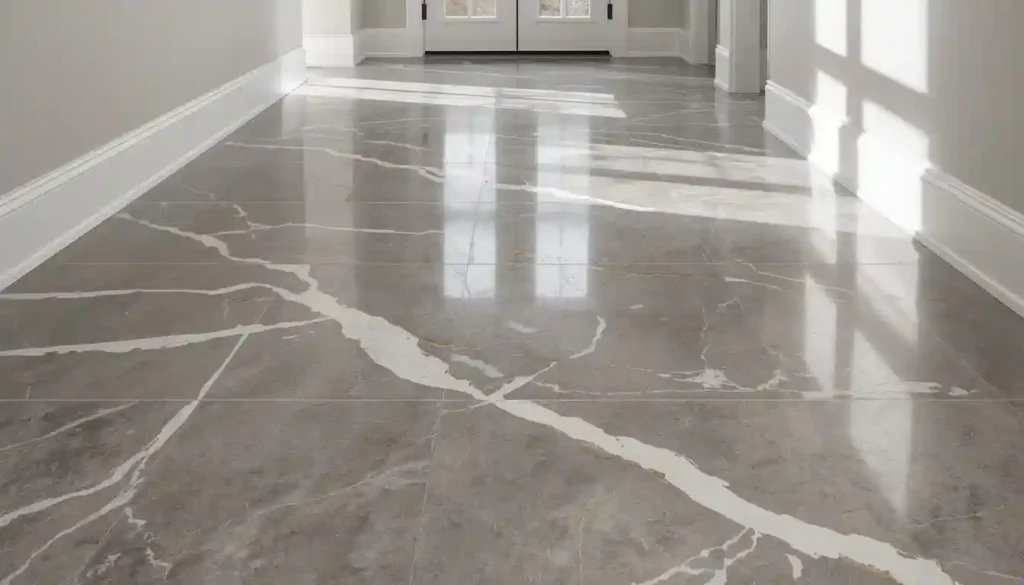
Choosing the Right Grey: Undertones, Finish, and Grout
The most common grey tile mistake is treating “grey” as a single, unambiguous color. Grey tiles have undertones just as paint colors do, and those undertones interact with your room’s light sources, wall colors, and furnishings in ways that can make the same tile look entirely different in two different rooms.
Cool grey tiles — those with a blue, green, or purple undertone — are the most commonly produced and read as the most visibly “grey” under most lighting conditions. They are a natural partner for white walls, chrome fixtures, concrete, and glass. Warm grey tiles — those with a taupe, beige, or brown undertone — are often called “greige” and are more forgiving in rooms with warm natural wood tones, cream or ivory wall colors, and bronze or gold hardware. Placing a cool grey tile in a room furnished with warm wood and cream walls will produce a result that reads as colder and bluer than it appeared on the showroom sample board; placing a warm grey tile in a white-and-chrome contemporary bathroom will often look muddy or indecisive rather than warm and sophisticated.
The finish of the tile changes its color as perceived in the room. Polished tiles reflect ambient light and appear lighter and more vivid than the same tile in a matte finish. Matte tiles absorb light and appear slightly darker and more muted. In rooms with limited natural light, polished grey tile can contribute meaningful brightness; in rooms with strong natural light, a polished tile may create glare. Honed tile — the flat, non-reflective finish applied to natural stone and some porcelain — occupies a middle ground that often reads as the most luxurious because it has depth without glare.
Grout color is a design decision, not an afterthought. Matching grout (within two to three shades of the tile) allows the floor to read as a continuous surface and is the correct choice when seamlessness is the goal. Contrasting grout — dark with light tile, or light with dark tile — emphasizes every individual tile and the pattern they form. This emphasis can be a feature (as with grey herringbone tiles where the grout defines the chevron pattern) or a liability (as with a large-format tile where visible grout lines interrupt what should be a nearly seamless surface). The best grout for tile flooring guide covers grout types, setting procedures, and color selection in detail, which is particularly useful once you have settled on a tile but are still working through the installation decisions.
Grey Tile by Room: A Quick Reference
Not every grey tile idea works in every room. The performance requirements for a shower floor are entirely different from those for a formal dining room, and the aesthetic logic shifts accordingly. For living rooms, large-format light to mid-grey matte porcelain or concrete-look tiles work best, producing a neutral canvas that functions across different furniture arrangements and color schemes over time. For kitchens, grey tiles need to balance aesthetic interest with practical concerns about staining, cleaning, and foot traffic; matte finishes, modest texture, and a grout color that won’t show daily cooking residue are the guiding principles.
In bathrooms, the full range of grey tile ideas in this guide applies, but the most important technical consideration is always slip resistance and moisture management. For entryways, the priority is durability against grit, sand, and wet shoes: a dense, hard porcelain tile with an anti-scratch surface treatment in a mid-to-dark grey (which conceals tracked-in dirt better than light grey) is the most functional choice.
For outdoor applications — patios, pool surrounds, covered terraces — frost resistance and DCOF slip ratings take precedence over aesthetics, though modern outdoor-rated grey tile offers a very wide aesthetic range within those technical constraints. If you are planning a grey tile floor for commercial purposes — a retail space, a café, an office — the standards for wear layer thickness and abrasion rating (PEI rating of 4 or 5 for commercial foot traffic) apply; the best tile flooring for commercial spaces resource covers these specifications alongside aesthetic recommendations for different commercial contexts.
Grey tile flooring rewards deliberate decision-making. The ideas in this guide represent thirteen genuinely different approaches to the same material family, each with its own design logic, room suitability, and practical implications. The most successful grey tile floors are not those that simply default to “grey is neutral and safe” — they are the ones where the designer or homeowner made specific, justified choices about tone, scale, pattern, and finish that align with the room’s architecture, its light, and the way it will be used every day.