Second, tile comes in an enormous range of sizes — from one-inch mosaic chips to 48-by-48-inch slabs — and that size range matters enormously in small rooms. The relationship between tile size and room size is counterintuitive in important ways, which several ideas below address directly.
Third, tile finishes (matte, polished, satin, textured) affect how light behaves in a room. In small spaces with limited window area, a polished porcelain floor can functionally double the amount of light bouncing around the room. That reflected light makes the space read as bigger even when the square footage has not changed.
Understanding how different tile patterns interact with a room’s proportions is the foundation that makes all fifteen ideas below more useful than a surface-level look at pretty pictures.
1. Large-Format Tiles in a Straight Lay
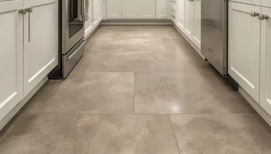
The most persistent myth in small-space tile design is that small rooms need small tiles. The logic seems intuitive — a big tile will overwhelm a little room — but it is exactly backwards. Large-format tiles, typically 24 by 24 inches or larger, dramatically reduce the number of grout lines crossing the floor. Fewer grout lines means the eye reads the floor as a single continuous plane rather than a grid of individual pieces. That continuous plane communicates spaciousness.
A standard 12-by-12-inch tile installed in a 60-square-foot bathroom creates roughly 120 tiles and dozens of visible grout lines. The same bathroom with 24-by-24-inch tiles has fewer than 20 tiles and far fewer grout lines. The brain registers the second floor as larger even though the room dimensions are identical.
For this to work, a few specifics matter. Choose a tile color close to your wall color — ideally within the same warm or cool family — so the floor blends into the walls rather than anchoring attention at the ground. Use unsanded or epoxy grout in a shade that closely matches the tile body. This detail turns each grout line from a visual interruption into something nearly invisible. Rectified tiles, which are cut to precise tolerances, allow the tightest possible grout joints and push this effect even further.
Porcelain is the most practical material here because large-format porcelain slabs are dimensionally stable and available in a wide range of finishes. Understanding what makes porcelain tile different from other ceramic options will help you evaluate specific products for this application.
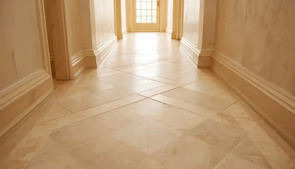
2. Diagonal Tile Layout
Rotating a standard square or rectangular tile 45 degrees and installing it on the diagonal is one of the oldest tricks in the spatial design playbook, and it remains effective precisely because it exploits a geometric truth: the longest straight line inside any rectangle runs diagonally from corner to corner. When tiles are set at 45 degrees, the grout lines point toward those corners rather than running parallel to the walls. The eye follows grout lines instinctively, and grout lines pointing toward corners draw the gaze outward rather than trapping it between two walls.
The effect is amplified in square rooms, where a straight grid can feel static because the wall lengths repeat in both directions. A diagonal grid breaks that repetition and gives the room a sense of movement and depth that did not exist before.
There is a practical tradeoff: diagonal installation produces more cut waste at the perimeter, typically 15 to 20 percent more than a straight lay. This increases both material cost and labor time. Planning the layout carefully before cutting — and centering the pattern from the room’s midpoint — minimizes waste and ensures that the cuts at the walls are consistent and clean rather than random slivers.
A medium-toned tile works better here than an extremely light or extremely dark option because diagonal grids at high contrast read very busy. The goal is a subtle widening of the room, not a checkerboard effect.
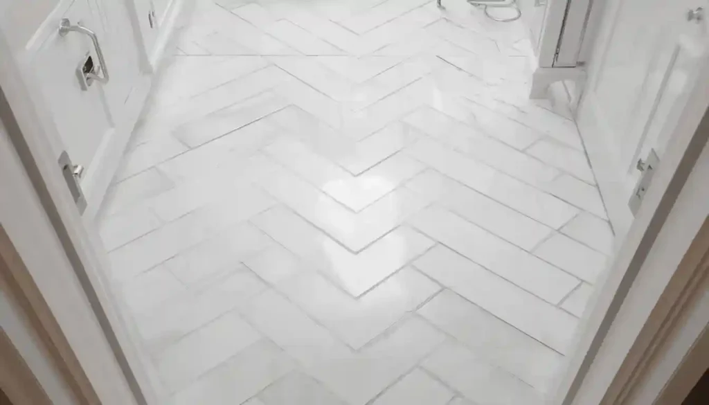
3. Herringbone Pattern with Rectangular Tiles
Herringbone is a V-shaped interlocking pattern created by placing rectangular tiles in alternating 45-degree angles. Its spatial effect depends on orientation. When the points of the V run parallel to the room’s longest wall, herringbone creates a strong directional pull that elongates the space — ideal for narrow rooms like bathrooms and corridors. When the V points toward the viewer, it creates depth, making the room feel like it recedes further than it actually does.
The scale of the tile matters. Slim rectangular tiles — something like 3-by-12 or 4-by-16 inches — produce a more delicate herringbone with tighter V-angles that suits small rooms well. Wider tiles create a bolder pattern that can overwhelm compact spaces unless the tile color is kept neutral.
Grout line width is particularly important in herringbone. Thin grout joints (1/16 to 1/8 inch) keep the pattern crisp and prevent the floor from reading as overly busy. Because herringbone creates more cuts than a straight lay, using a tile with some length-to-width variance — like a handmade-look tile with slightly irregular edges — can mask small alignment imperfections more gracefully than a perfectly rectified tile would.
Porcelain and ceramic both work well here. For small bathrooms specifically, selecting a tile rated for wet environments is essential — herringbone’s appeal is lost if the material is wrong for the application.
4. Monochromatic Tile and Grout Pairing
One of the most powerful things you can do in a small-space tile installation has nothing to do with pattern or size — it is simply matching the grout color to the tile as closely as possible. When grout and tile read as one color, the grid of lines disappears and the floor becomes a single continuous field. The room’s perimeter — its walls and corners — becomes the boundary the eye registers, not the individual tile edges. This communicates space.
The principle works across color families. A pale gray tile with pale gray grout, a warm ivory tile with a sand grout, a charcoal tile with a dark charcoal grout — all produce the same boundary-erasing effect as long as the tone match is close. The mistake is choosing a grout that is dramatically lighter or darker than the tile, which causes every grout line to draw attention and fragments the floor into its component pieces.
This is also a maintenance consideration worth stating plainly: lighter grout in small, frequently-wet spaces like bathrooms and mudrooms shows discoloration faster. A medium-toned grout matched to a medium-toned tile gives you the spatial benefit of visual continuity and ages more gracefully than stark white grout in a high-traffic room.
The one exception where contrast works in small spaces is an intentional two-color design where the pattern itself is the design statement — idea number five covers that specific case.
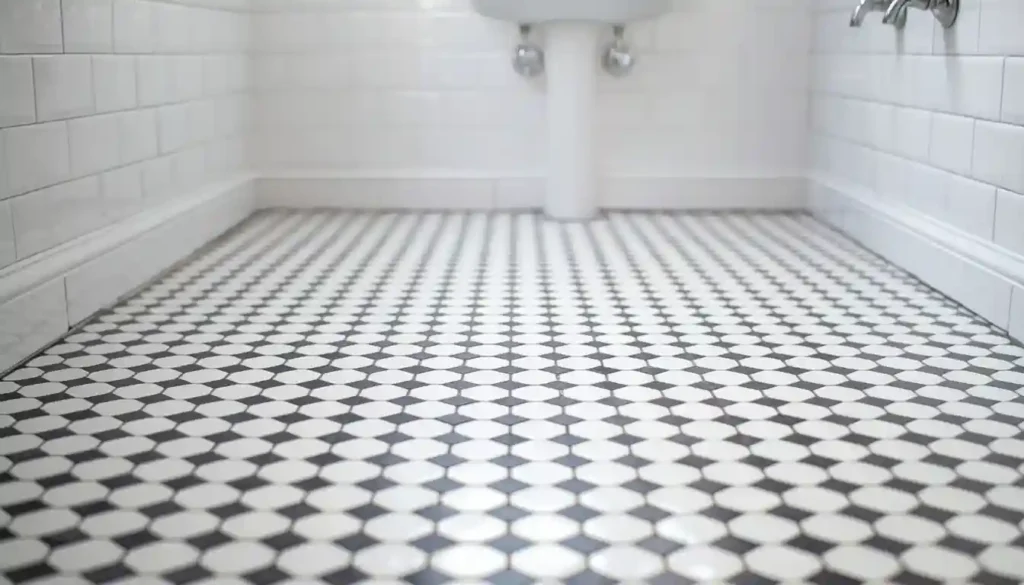
5. Black and White Checkerboard in Small Format
Checkerboard seems like a counterintuitive choice for a small space — high contrast, strong pattern, visually active — and yet it has appeared in small European bathrooms and kitchen floors for centuries for good reason. The regular repetition of the pattern creates a visual rhythm that the brain reads as orderly rather than chaotic. That order communicates control over the space, not claustrophobia.
The key for small rooms is proportion. Classic Victorian checkerboard used 12-by-12-inch tiles, which can feel heavy in a very small bathroom. Scaling down to 4-by-4 or even 2-by-2-inch square tiles keeps the rhythm of the pattern but reduces the visual weight of each individual element. Hexagonal tiles in black and white create the same checkerboard feel with a more contemporary edge — the softer geometry of the hex shape reduces the rigidity that square tiles can impose.
The optical illusion value of checkerboard in small spaces is real: because the pattern’s alternating darks and lights reflect and absorb light in equal measure, the floor recedes rather than dominating the room. It becomes a backdrop rather than a foreground element, which is exactly what a small room floor should do.
Keep the walls, trim, and fixtures in the room light and simple. The floor’s pattern already provides all the visual energy the space needs.
6. Light-Colored Polished Porcelain for Reflectivity
In rooms where natural light is limited — interior bathrooms, basement areas, narrow corridors — the floor’s ability to reflect available light becomes a significant spatial asset. Polished porcelain, particularly in white, cream, or very light gray, acts as a passive mirror for any light source in the room. Overhead fixtures, vanity lights, and natural light from windows all bounce off a polished floor and travel further into the room than they would off a matte surface.
The result is a room that reads as brighter and therefore larger. Studies of interior perception consistently show that perceived brightness and perceived spaciousness are closely linked — the more light appears to fill a room, the more generous the space feels, independent of actual dimensions.
For floor applications, a satin or low-sheen polished finish is more practical than a full high-gloss mirror finish. High gloss shows every water spot, footprint, and scratch, which creates maintenance demands that erode the benefits over time. A satin porcelain gives you roughly 70 percent of the light-reflectance benefit with far better practical durability.
Pair light polished floors with soft white or very pale walls to keep the light bouncing throughout the room rather than being absorbed. This is especially effective in small bathrooms where tiling the lower half of the walls in the same tile extends the reflective floor upward.
7. Elongating Rectangular Tiles Laid Lengthwise
Long, narrow rectangular tiles — think 12-by-24, 6-by-36, or even 4-by-24 inches — have an inherent directional quality that square tiles lack. When installed with the long axis running toward the farthest wall from the entry point, they draw the eye deeply into the room along the length of each tile. The room appears to extend further than it does because the viewer’s gaze is actively pulled forward.
This is particularly effective in narrow rooms like galley kitchens and corridor bathrooms, where the short dimension is the problem and the long dimension needs to feel generous. Orienting long tiles toward the far end emphasizes that length and minimizes the perception of the constrained width.
For square rooms, a different approach works better: orient the long tiles toward the widest wall, perpendicular to the main viewing direction. This creates a broadening effect, pulling the eye toward the sides rather than straight ahead.
The tile size trend in 2025 and 2026 has moved toward longer rectangles — 4-by-24 and similar proportions — rather than the traditional 3-by-6 subway proportions. These longer formats have a clean, contemporary look and their directional pull is stronger than shorter tiles, making them especially useful in tight spaces.
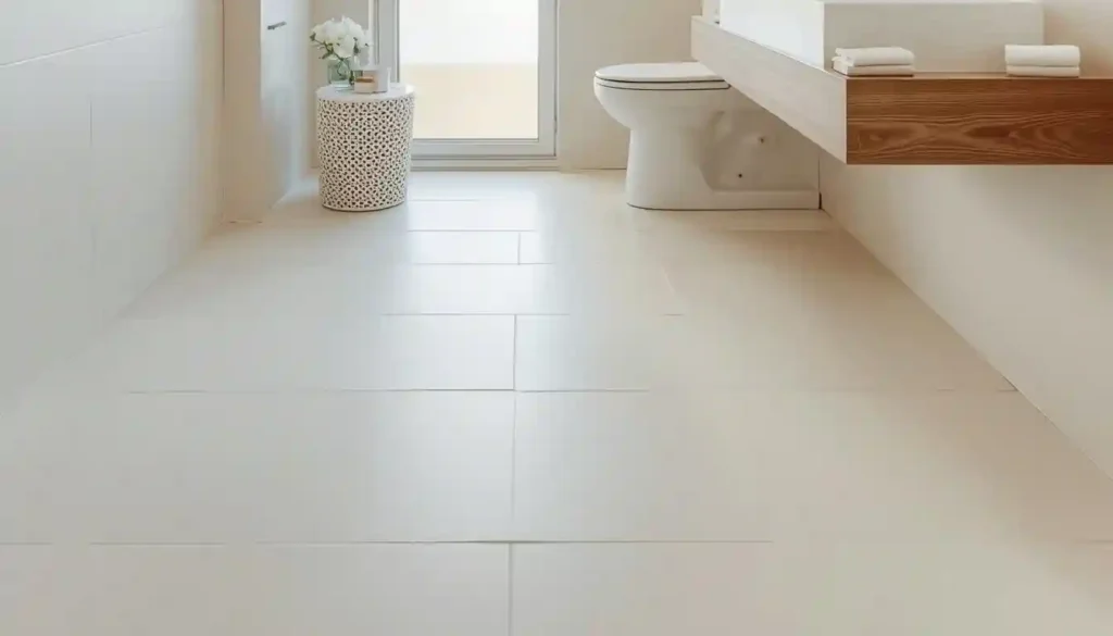
8. Continuous Floor-to-Wall Tile in One Color
One of the boldest and most effective ways to open up a small room is to eliminate the visual boundary between floor and wall by running the same tile across both surfaces. When floor and wall share an identical tile, the eye loses its reference point for where the room ends — the corners become less defined, the room feels taller and wider, and the space takes on an almost sculptural quality.
This approach is most common in bathrooms, where tile is already expected on both surfaces, but it works in laundry rooms, mudrooms, and even compact utility kitchens. The practical requirement is that the tile needs to be suitable for both floor and wall use, with appropriate slip resistance on the floor surface (typically a COF of 0.42 or higher for residential wet areas).
Color matters enormously here. A dark tile run floor-to-wall in a small room can feel like the inside of a box — dramatic for a moody spa aesthetic, but oppressive if that is not the intention. A light to medium tone maintains the boundary-dissolving effect while keeping the room feeling open. Textural variation within the color — a tile that has slight variation in tone and surface texture — prevents the result from feeling flat.
This technique also works when the floor tile transitions into a feature wall using a different format of the same tile — for example, large-format tiles on the floor and the same material in a smaller mosaic or different orientation on one wall.
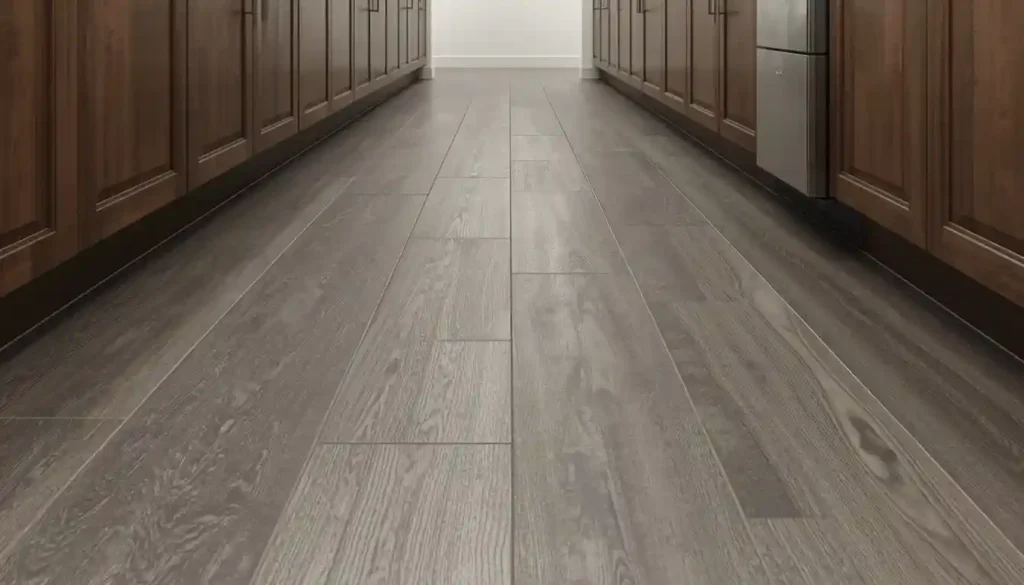
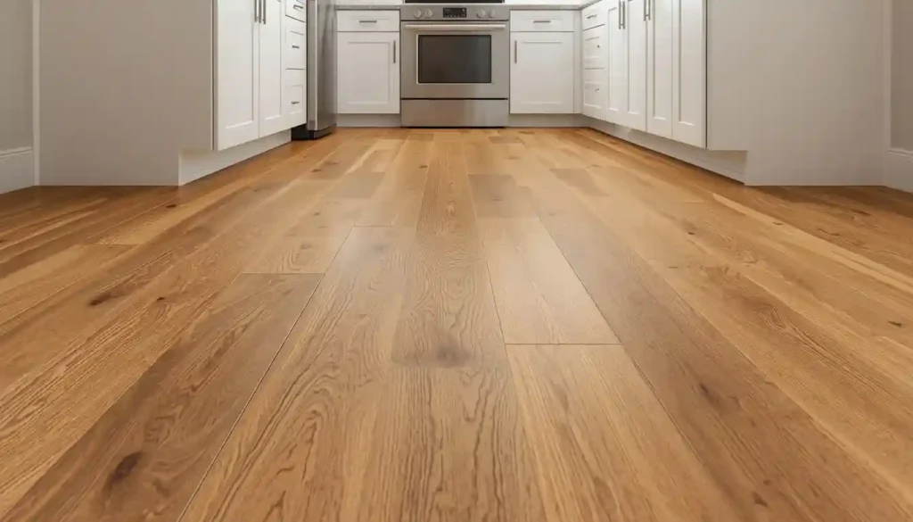
9. Wood-Look Porcelain Planks
Not every small-space tile application calls for a traditional tile aesthetic. Wood-look porcelain tiles — which replicate the appearance of hardwood or engineered wood through high-resolution inkjet printing and surface texturing — give you the spatial benefits of long rectangular tile in a format that blends seamlessly with non-tiled adjacent rooms.
In open-plan layouts where a small kitchen or dining area connects to a larger living space, using wood-look tile in the compact zone while the larger space has actual hardwood creates visual continuity that makes both areas feel like part of one cohesive floor plane. The eye does not register a sudden change at the threshold, and the small zone borrows perceived scale from the larger area it connects to.
From a performance standpoint, porcelain is more practical than real wood in rooms exposed to moisture, steam, or heavy cleaning — kitchens, bathrooms, and mudrooms all benefit from the water resistance porcelain provides while still allowing you to maintain a warm, wood-toned aesthetic throughout your home.
The visual design principles are the same as for elongating rectangular tiles: orient the plank direction toward the far wall for maximum depth, and choose a light to medium wood tone that reflects rather than absorbs the room’s available light. If you are comparing this to other flooring approaches, understanding where tile outperforms wood on a practical level can help you make a confident choice.
10. Encaustic-Style Cement Look Tiles in a Feature Zone
Using patterned tile throughout an entire small room can overwhelm it. Using it in a strategically placed zone creates a focal point that draws attention deliberately and makes the rest of the space feel larger by contrast. Encaustic-style tiles — which feature geometric or floral patterns, often in two or three colors — are well suited to this approach.
The most effective placement in a small space is a bordered inset: a rectangular field of patterned tile centered in the floor, surrounded by a border of plain tile in one of the pattern’s colors. The border grounds the pattern and gives the eye a place to rest before and after engaging with the more complex design. Without the plain border, a patterned tile can feel relentless in a compact room.
Scale the pattern to the room. A bold 12-by-12-inch encaustic tile with a complex four-color Moorish motif is better suited to a room of at least 80 square feet. In a very small bathroom under 40 square feet, a simpler two-color geometric in a smaller 6-by-6-inch format gives visual interest without visual overload.
Encaustic patterns work particularly well in transitional and Mediterranean-influenced home styles. They can bring significant design interest to a small entryway or powder room that sees many visitors — precisely the rooms where a strong first impression matters most.
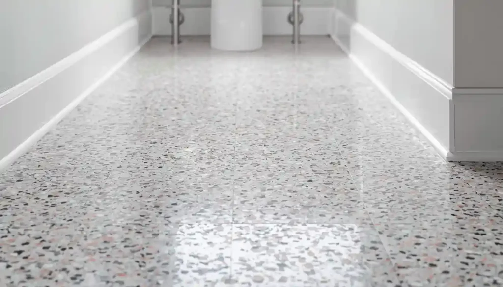
11. Terrazzo-Look Tiles
Terrazzo has made a significant comeback in contemporary interiors, and for small spaces specifically, its particular visual character is an asset. Terrazzo consists of aggregate chips — marble, glass, quartz, or granite — embedded in a cementitious or resin base. Modern terrazzo-look porcelain tiles replicate this aesthetic through printing and surface treatment, offering the look without the cost of poured terrazzo installation.
What makes terrazzo effective in small spaces is its distributed visual texture. Unlike large veined marble or a bold geometric pattern, terrazzo distributes its visual interest evenly across the entire surface — there are no dominant lines pulling the eye in one direction or concentrated areas of pattern that demand attention. The floor reads as active and interesting but without the directional energy that can make a small room feel constricted.
Light-colored terrazzo with small aggregate — white or pale gray base with soft pink, cream, and gray chips — is particularly effective in small bathrooms and compact kitchen areas. It reads as sophisticated and fresh without competing with fixtures, cabinetry, or wall treatments.
The other practical advantage is that terrazzo-look tile is forgiving of irregular grout lines because the pattern’s variation masks small imperfections. For DIY installations in small spaces, this forgiveness is worth noting.
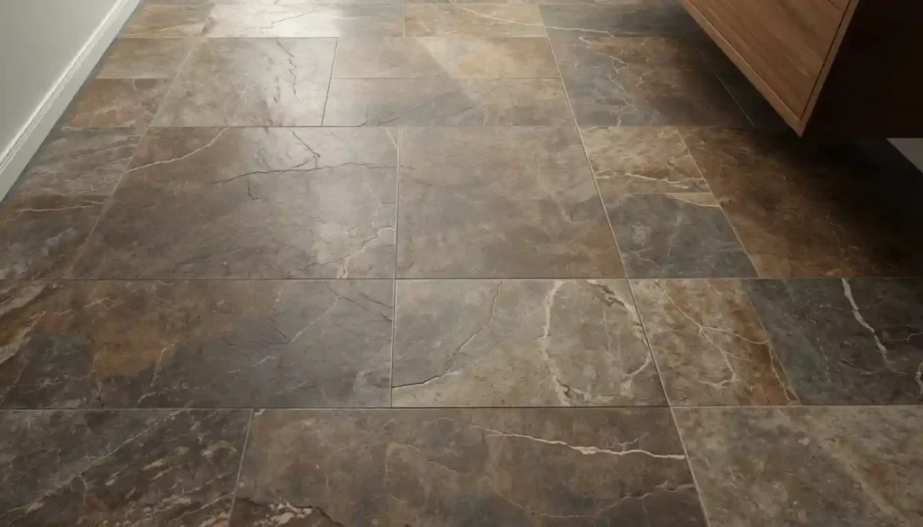
12. Slate-Effect Textured Tiles for Depth Without Pattern
Matte, textured tiles that replicate natural stone — slate, limestone, travertine — bring a different spatial quality to small rooms compared to polished or patterned options. Instead of reflecting light outward, textured stone-effect tiles absorb light and create subtle shadows across their surface. This gives the floor a sense of depth and mass that prevents it from feeling flat or clinical.
In small rooms that risk feeling sterile — a compact bathroom with white walls and minimal furniture, for example — a slate-effect floor adds the material warmth that prevents the space from feeling hollow. The depth of the texture reads as quality, which shifts the perception of the space from “small and basic” to “small and refined.”
The most effective sizes here are 12-by-24-inch or 18-by-18-inch tiles in medium slate tones — dark enough to have visual weight but not so dark as to absorb all the room’s light. Warm slate tones (greens, warm grays, brown-grays) work better in small rooms than cool blue-gray slates, which can make compact spaces feel cold.
Pair slate-effect floors with warm wood vanities or oak cabinet fronts to create the kind of nature-meets-craft aesthetic that is currently dominant in contemporary bathroom design. This natural material pairing prevents the textured tile from feeling like a utilitarian choice.
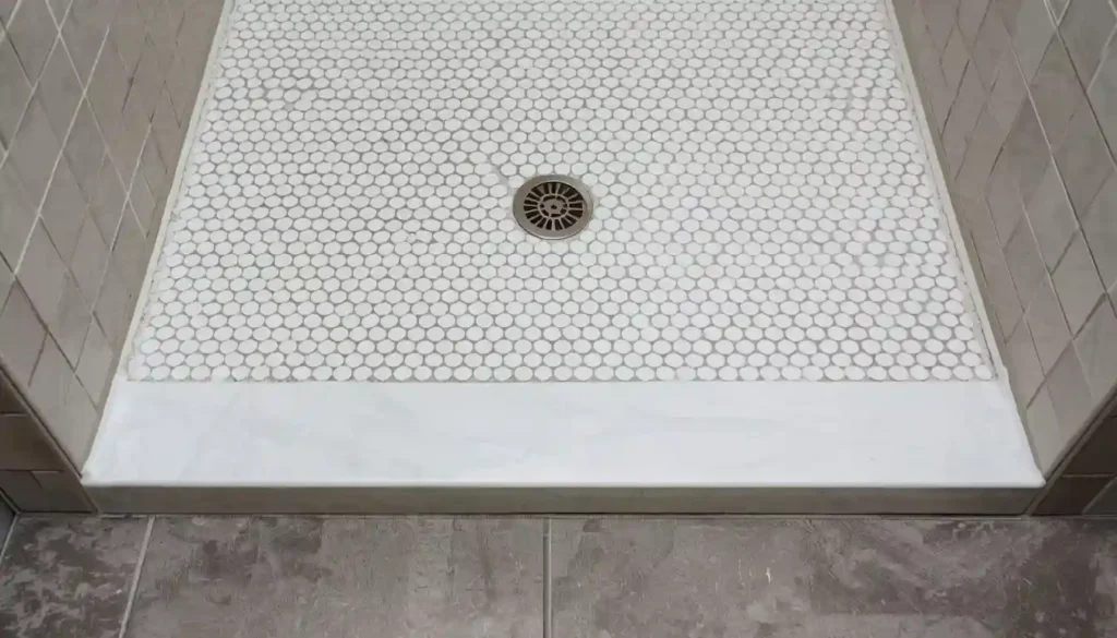
13. Mosaic Tiles as an Accent Floor in Wet Zones
Earlier, the article argued against small tiles for small rooms — and the general principle holds. But mosaic tiles (typically one-inch to two-inch chips mounted on mesh backing) are a case where the exception is as interesting as the rule. Used specifically in the shower floor or in a small wet zone within a larger tiled space, mosaics serve two functions: they increase surface traction in wet areas (critical for safety), and they create a deliberate visual zone that distinguishes the shower floor from the bathroom floor without requiring a hard threshold.
The design strategy is to use a large-format tile on the main bathroom floor and transition to a mosaic in the shower — keeping both in the same or closely related color families so the floor reads as cohesive even as the format changes. A pale gray 24-by-24-inch porcelain on the main floor and a pale gray penny-round mosaic in the shower creates exactly this layered effect.
Mosaic tiles are also among the most practical solutions for shower floors because their small size allows the floor to pitch toward the drain without the lippage issues that plague large tiles in sloped applications. The mesh-backed installation system simplifies layout and cutting around drain hardware.
If you are working with a tiled bathroom and considering your full material approach, understanding the installation requirements for different tile types and sizes helps you avoid problems after the tile is set.
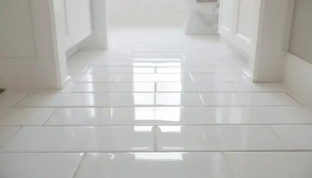
14. Narrow Subway Tiles in a Vertical Stack
Classic 3-by-6-inch subway tile is one of the most durable design choices in the history of interior design, but its typical horizontal brick-bond installation on walls translates surprisingly well to floors — particularly in small bathrooms and mudrooms. On the floor, subway tiles can be installed in a straight stacked grid, a running bond (offset pattern), or as herringbone. Each installation pattern creates a different spatial effect, and each is worth understanding.
A stacked grid (tiles lined up in straight rows both across and down) creates the cleanest, most minimal look. The regular grid has a strong architectural quality that suits Scandinavian and modern interior styles. The grout lines form a precise matrix that the eye reads as orderly and controlled.
For small rooms specifically, the horizontal running bond installed perpendicular to the longest wall — tiles running across the short dimension — emphasizes the width of the room. The long axis of each tile points side to side rather than front to back, and the eye follows the tile’s direction. In a narrow bathroom where the room is, say, five feet wide and nine feet long, horizontal orientation visually widens the five-foot dimension.
Gloss-finish subway tile amplifies the light-reflection benefits and keeps the surface easy to clean, making it a strong practical choice for wet rooms in addition to its visual contribution.
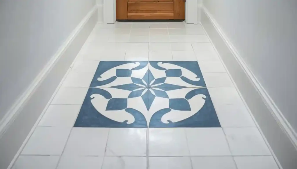
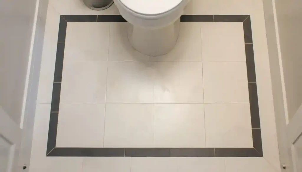
15. Two-Tone Tile Inlay with a Contrasting Border
A framed or bordered floor is an old device from classical European tile-making that solves a genuine problem in small rooms: how to give the space a defined sense of center and intentionality without adding physical furniture or architectural elements that take up square footage. A framed tile design creates the visual impression of a rug — a centered, bounded element — using only the floor surface.
The construction is straightforward. The main floor field uses one tile (typically a large-format neutral). A single border course runs around the perimeter, set back 12 to 18 inches from the walls, in a contrasting or complementary tile. Inside the border, the field tile continues to the center of the room. The border frames the space and gives it a compositional logic that makes the room feel designed rather than simply tiled.
In very small rooms — under 50 square feet — even a single course of a contrasting border tile creates this effect. The border does not need to be dramatically different in color from the field; a change in finish (matte field with a polished border), a change in size, or a subtle change in tone (warm white field with a soft gray border) is enough to define the frame.
This approach is especially effective in small entryways, powder rooms, and narrow bathrooms where there is no room for actual furnishings to anchor the space. The floor itself becomes the room’s organizing element.
For anyone weighing the material and pattern options for their specific project, consulting a comprehensive tile buying guide ensures you evaluate both design and practical performance factors before committing to a layout.
How to Choose Among These 15 Ideas for Your Specific Room
Reading fifteen tile ideas back to back raises an obvious question: which one is right for your room? The answer depends on a combination of the room’s actual dimensions, the amount of natural light it receives, the style of adjacent spaces, and your budget for both materials and installation labor. Here is how to narrow the field.
Rooms under 40 square feet — small powder rooms, narrow shower rooms, tight laundry closets — benefit most from ideas that minimize visual complexity. Large-format tiles in a straight lay with matching grout (ideas 1 and 4), the continuous floor-to-wall approach (idea 8), or the light polished porcelain for reflectivity (idea 6) are strongest in very confined spaces. Pattern-based ideas work better when the room is at least 50 to 60 square feet and has enough surface area for the pattern to read as a pattern rather than as noise.
Rooms with limited natural light benefit from reflective finishes — polished or satin porcelain in light colors (ideas 6 and 7) and the white glossy subway tile approach (idea 14). If the room has good natural light, you have more freedom to use matte textured tiles (idea 12) or terrazzo-look options (idea 11) without the space feeling dim.
Narrow rooms — corridors, galley kitchens, long thin bathrooms — benefit most from directional ideas: elongating rectangular tiles laid lengthwise (idea 7), herringbone with the V pointing toward the far wall (idea 3), or diagonal installation that draws the eye to the corners (idea 2).
Square rooms are the hardest to work with in small footprints because every dimension is equally constrained and there is no long axis to exploit. The diagonal tile layout (idea 2), the monochromatic full-room approach (idea 8), or the bordered inlay (idea 15) all work well in square rooms by either disrupting the grid geometry or creating an internal organizing structure that overcomes the static quality of equal walls.
It is also worth noting that several of these ideas combine naturally. A large-format tile in a diagonal layout (ideas 1 and 2 together) is stronger than either alone. A wood-look porcelain plank with matching grout (ideas 9 and 4 combined) gives you continuity with adjacent wood floors and the grout-minimizing effect simultaneously. Thinking about which ideas reinforce each other is how experienced designers build layered results rather than single-note ones.
For small spaces that cross into rooms where water or humidity is a regular presence, material performance cannot be separated from design choice. Knowing how tile performs in wet conditions relative to other materials helps you understand why certain tile recommendations appear so consistently in bathrooms and kitchens rather than in living rooms — and why those recommendations hold up over time.
The Grout Factor: A Variable Most Homeowners Underestimate
This article has mentioned grout color several times, but the point is important enough to address directly. Grout selection is one of the highest-leverage decisions in small-space tile design, and it is almost always treated as an afterthought.
Here is the practical reality: grout lines cover between 5 and 15 percent of a tile floor’s total surface area, depending on tile size and joint width. That means every grout choice creates a pattern — a grid, a herringbone shadow, a diagonal lattice — that overlays the tile pattern. When grout and tile read as the same color, that overlay disappears and the tile’s surface takes precedence. When grout contrasts with the tile, both patterns compete for attention simultaneously.
In large rooms, that competition is often desirable — it creates visual richness. In small rooms, visual richness at floor level can overwhelm the space. The general guidance is to bias toward tone-matched grout in small rooms, and to use contrasting grout only when the pattern contrast is intentional and the room has at least moderate visual breathing room (50 to 60 square feet).
The black-and-white checkerboard (idea 5) is the explicit exception — there, the contrast between tile and grout is the design, and the visual energy it creates is the intended effect. But in most other small-space applications, matching grout is the stronger choice.
One practical tip: grout appears significantly darker when wet than when dry, and it often cures to a shade slightly different from its packaged color. Always test grout in place using spare tiles before committing to an installation, and allow the test sample to dry completely (24 hours minimum) before making a final judgment.
Installation Direction and the Perception of Space
The direction of tile installation — particularly for rectangular and plank-format tiles — is one of the most impactful and least expensive spatial decisions available in a small-room renovation. It costs no additional material and only minimal additional labor planning, but its effect on how the room reads is significant.
The basic principle is that grout lines act as visual arrows. The eye follows lines. Long parallel grout lines pointing toward a far wall make the room feel deeper in that direction. Long parallel grout lines running side to side make the room feel wider. Lines running on the diagonal (as in ideas 2 and 3) direct the eye toward corners, which makes both the depth and the width feel more generous simultaneously.
For most small rooms where one dimension is more constrained than the other, the installation direction should emphasize the room’s longer dimension. A bathroom that is 5 feet wide by 9 feet long should have tile lines running toward the 9-foot wall. A kitchen that is 7 feet wide by 14 feet long should have tile lines running toward the 14-foot wall. This is not a rigid rule — other factors including cabinet and door placement may override it — but it is a strong default.
Understanding these orientation principles is closely related to understanding which direction you should lay tile flooring in different room configurations. The visual logic carries across all flooring types, but tile’s visible grout lines make the effect more pronounced than it would be with a seamless material.
Grout Line Width in Small Spaces
Beyond grout color, grout line width deserves attention. Standard tile installation uses grout joints of 1/8 to 3/16 inches for most ceramic and porcelain tiles. Rectified tiles — tiles precision-cut to exact tolerances — allow joints as narrow as 1/16 inch. In small rooms, narrower joints reduce the total amount of grout visible on the floor surface, which strengthens the effect of any tone-matching strategy and makes large-format tiles feel even more seamless.
The limitation on joint width is calibration: very narrow joints demand very consistent tile flatness and precision installation. If the subfloor has any variation, narrow joints can result in lippage — the condition where tile edges sit at different heights, creating a rough surface that catches feet and degrades the tile edge over time. Before specifying very narrow grout joints, confirm that the subfloor is within manufacturer tolerances for flatness (typically no more than 3/16 inch variation over a 10-foot span).
For DIY installations in small rooms, a 1/8-inch joint with tone-matched grout achieves nearly all the spatial benefit of a 1/16-inch joint while being significantly more forgiving of the minor subfloor variations and tile calibration differences that characterize real-world installations.
Tile Patterns and Room Decor Coherence
Even the most spatially effective tile idea can undermine a room if it conflicts with the overall design direction. The spatial strategies in this article — diagonal layouts, large formats, elongating planks — all assume that the tile works within a coherent interior direction. A few principles help ensure coherence.
Cool-toned tiles (white, gray, blue-gray) align naturally with contemporary, Scandinavian, and coastal interior styles. Warm-toned tiles (cream, ivory, warm gray, terracotta) suit transitional, farmhouse, and Mediterranean aesthetics. Choosing a tile whose color temperature matches the room’s other finishes — wall paint, cabinet color, fixture metal — keeps everything feeling intentional.
Pattern complexity should increase as room size increases. In the smallest rooms, the most effective tile choices are typically the simplest — large-format neutrals with matching grout, subtle texture without bold pattern. In rooms approaching 80 to 100 square feet, more pattern energy is manageable. The encaustic insets (idea 10), terrazzo (idea 11), and bordered inlays (idea 15) all work better in spaces with enough surface area to let the pattern breathe.
Understanding how to match tile flooring with room decor is a discipline that extends beyond this article’s focus on spatial expansion — but getting the spatial tools right and then applying them within a coherent design direction is what separates a tile floor that genuinely transforms a small room from one that merely fills it.
Putting It Together: A Room-by-Room Summary
For a small bathroom under 50 square feet with limited natural light, the strongest combination is large-format light polished porcelain in a straight lay with tone-matched grout — drawing from ideas 1, 4, and 6. If budget allows, extending the same tile up the lower 24 inches of walls borrows from idea 8 and compounds the spatial effect.
For a narrow galley kitchen, elongating rectangular wood-look porcelain planks oriented toward the far wall with matching grout (ideas 7 and 9 combined) creates both visual depth and practical water resistance. This combination also allows the kitchen floor to read as continuous with wood floors elsewhere in the home.
For a small entryway or mudroom, the diagonal layout (idea 2) or the bordered inlay (idea 15) both work well because entry floors are seen from above and the pattern reads most legibly from that angle. A durable, easy-clean porcelain in a medium tone handles the wear these spaces receive while the layout strategy handles the spatial challenge.
For a compact powder room where design impact is a priority, the checkerboard (idea 5), encaustic inset (idea 10), or terrazzo-look tile (idea 11) all make strong statements in the small footprint where guests spend brief, focused time. These pattern-forward approaches work here because the room’s sole purpose is impression rather than lived-in daily function.
Tile flooring in small spaces rewards careful thinking before purchase and installation. The ideas in this article are starting points — each one can be adapted to specific room proportions, existing finishes, budget constraints, and personal taste. The underlying principles (minimize visual fragmentation, use directional elements to guide the eye, manage light through finish selection) remain constant even as the specific tile choices shift. Apply the principles, choose a tile that supports them, and the room will do the rest.